Brand identity · SemiExponent

Physics-first semiconductor research and analysis, for technology investors and chip companies.
Overview
The brief
Semiconductor research for investors and chip companies.
- Problem
- SemiExponent was an early-stage boutique consultancy in the semiconductor space, with solid work behind it. It needed a brand that a serious audience of investors and chip companies would trust, without going cold. As the designer, I also wanted it to carry the founder’s playfulness alongside his precise, rigorous work.
- Needed
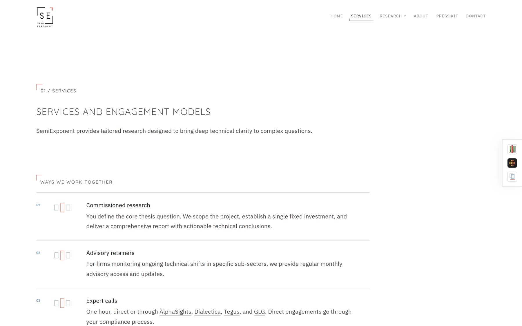
- The identity (mark, colour, type), NFC and print business cards, signage, and the website: an interactive landing page, a store for the research reports, and an admin panel so the firm can edit its own copy.
SemiExponent publishes semiconductor research and analysis for technology investors and chip companies.
The mark
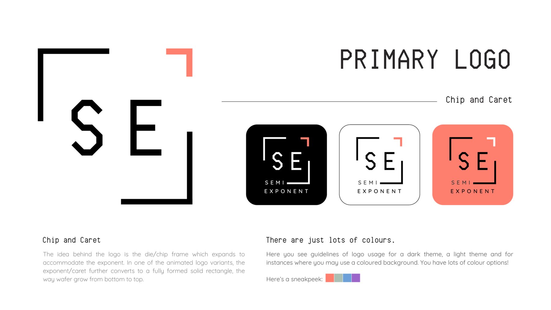
Chip and caret.
The logo is a chip (die) frame that opens to make room for an exponent. In one animated version, the caret grows into a solid rectangle, the way a wafer is built up from the bottom.
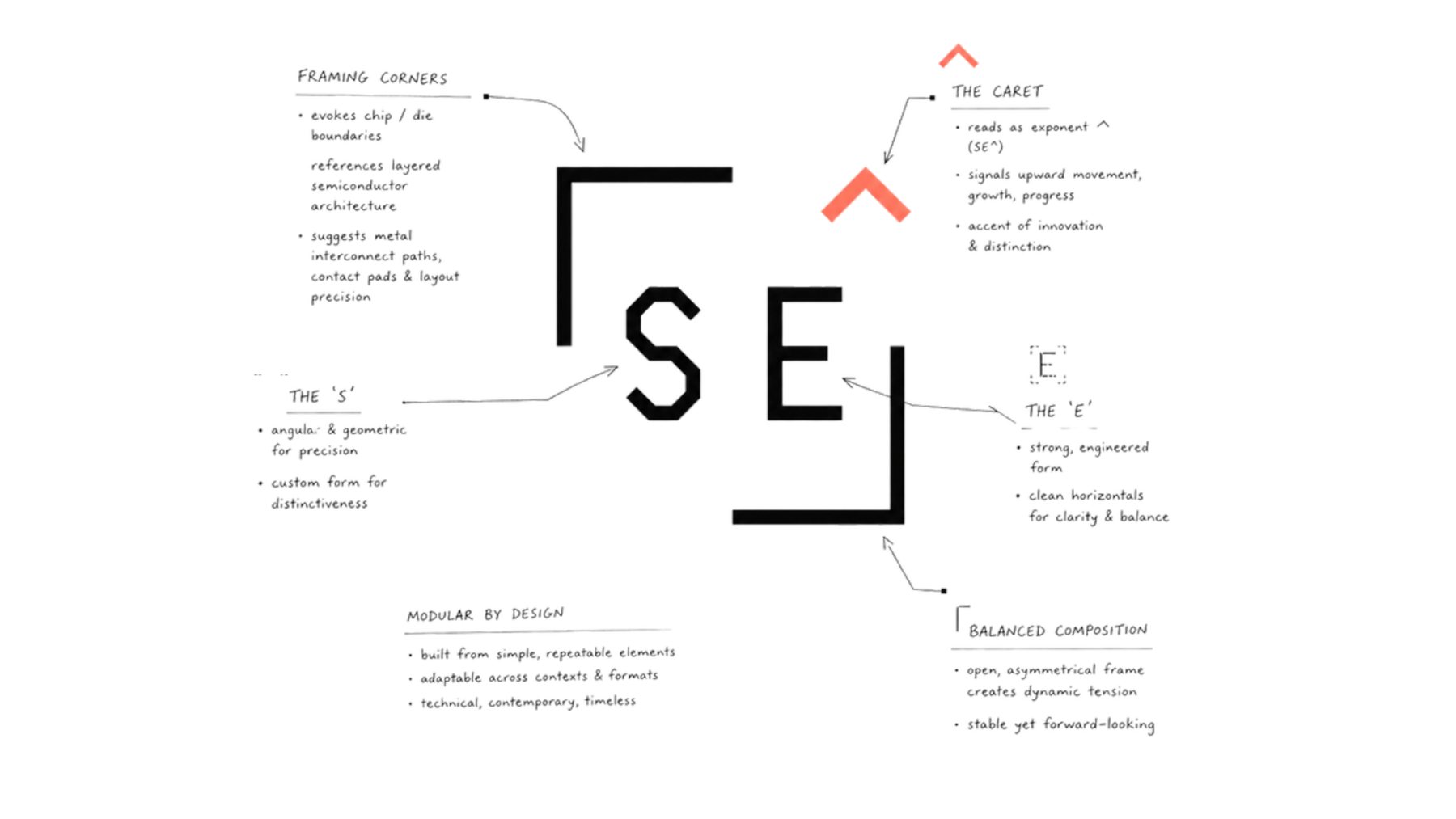
Anatomy
What each part means.
Built from a few simple, repeatable parts, so it works at any size and in any format.
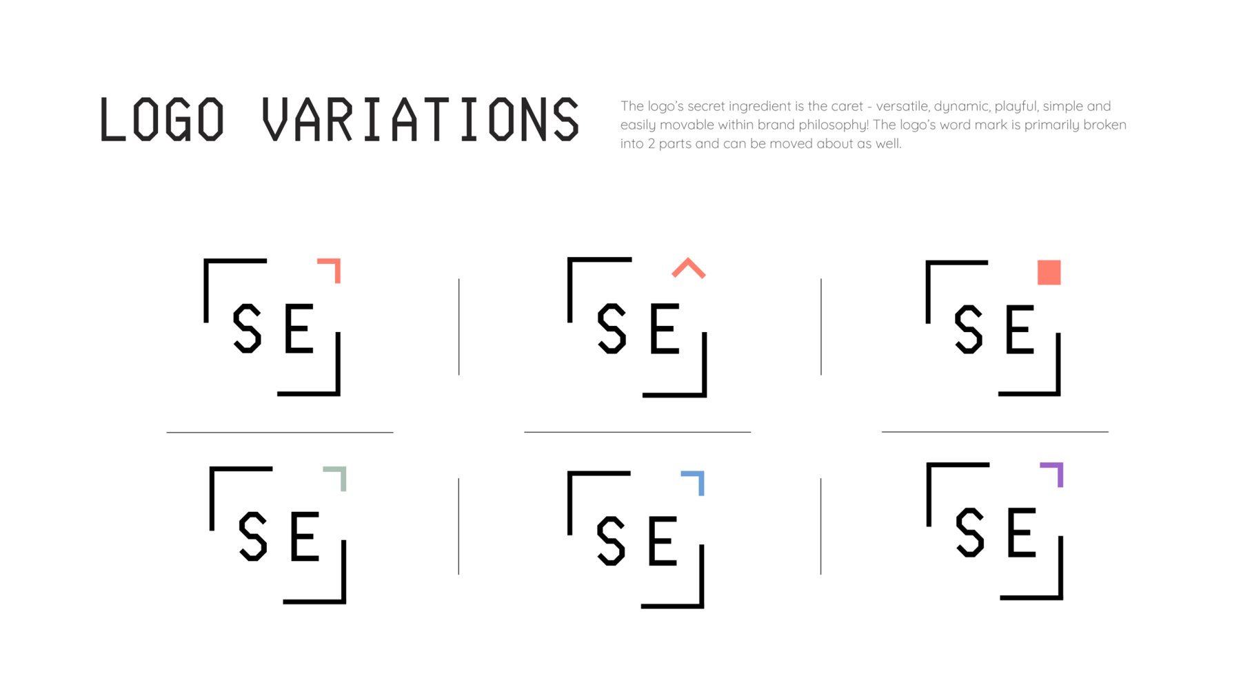
Logo variations
The caret changes; the frame stays.
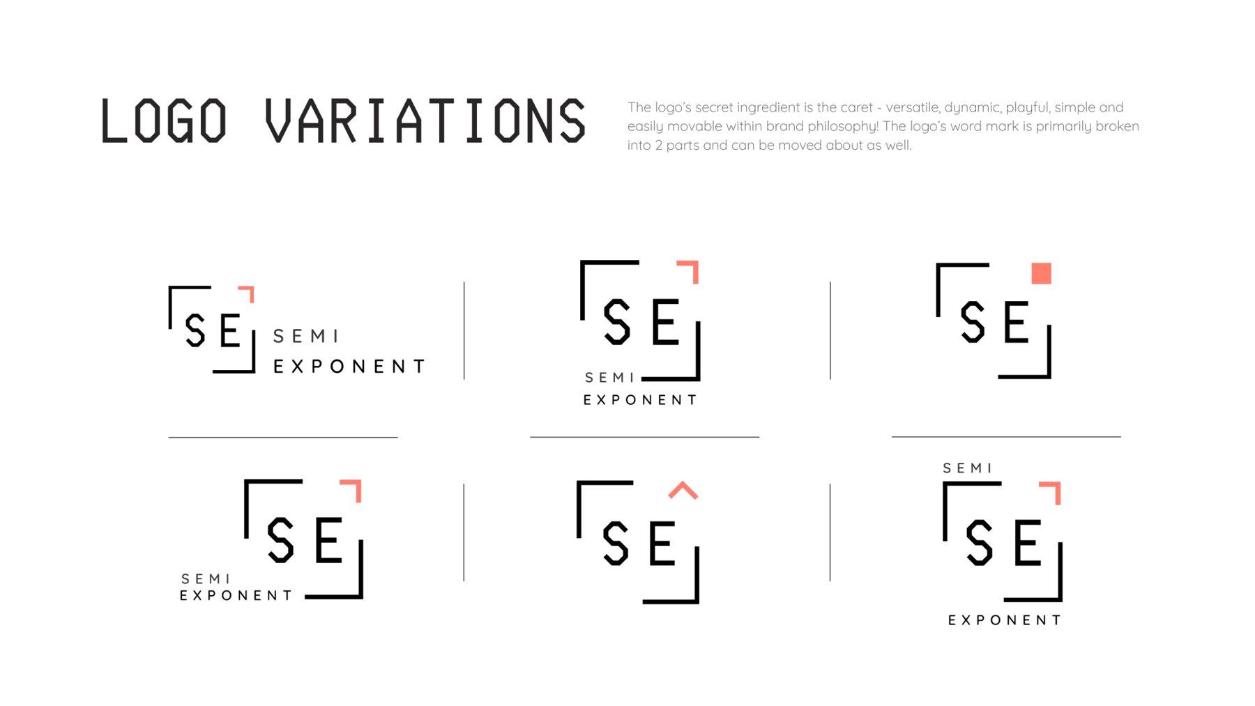
The caret can flip, fill, change colour or become a solid chip. The wordmark splits into SEMI and EXPONENT and moves around the frame to suit the layout.
Colour
Charcoal, white and coral.
The mark works on dark, light or coloured backgrounds. Coral is the caret colour; sage, blue and violet are secondary.
Typography
Typography.
The primary typeface is Computer Says No, a PC-inspired sans. Geo is its free alternative. Quicksand, with rounded ends, is used for body text.
v w x y z 1 2 3 4 5 6 7 8 9 0 & % $ !
v w x y z 1 2 3 4 5 6 7 8 9 0 & % $ !
Stationery & signage
Business card and signage.
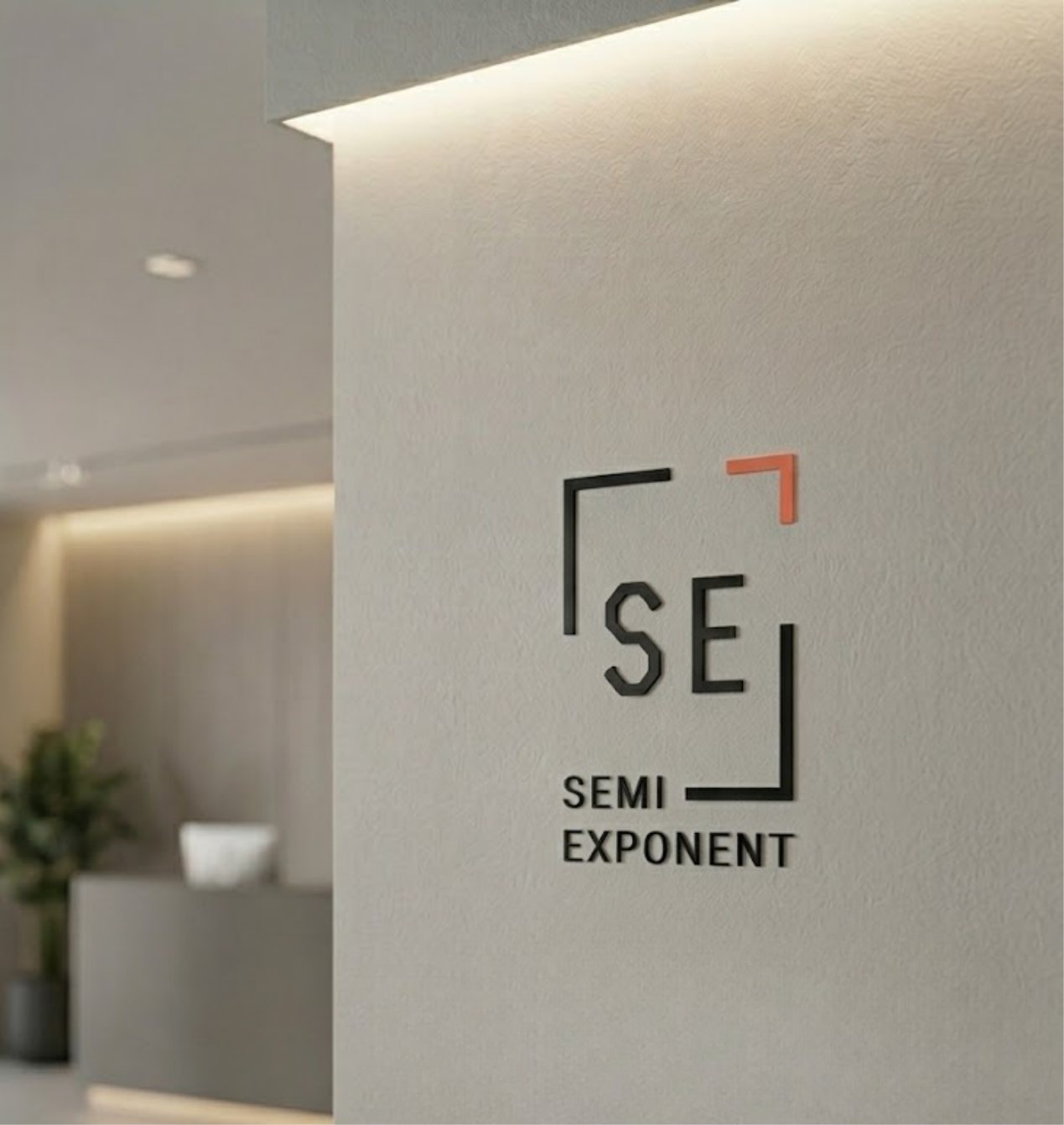
An NFC business card in black, and the mark as 3D wall signage. The frame reads clearly at both sizes.

In the wild
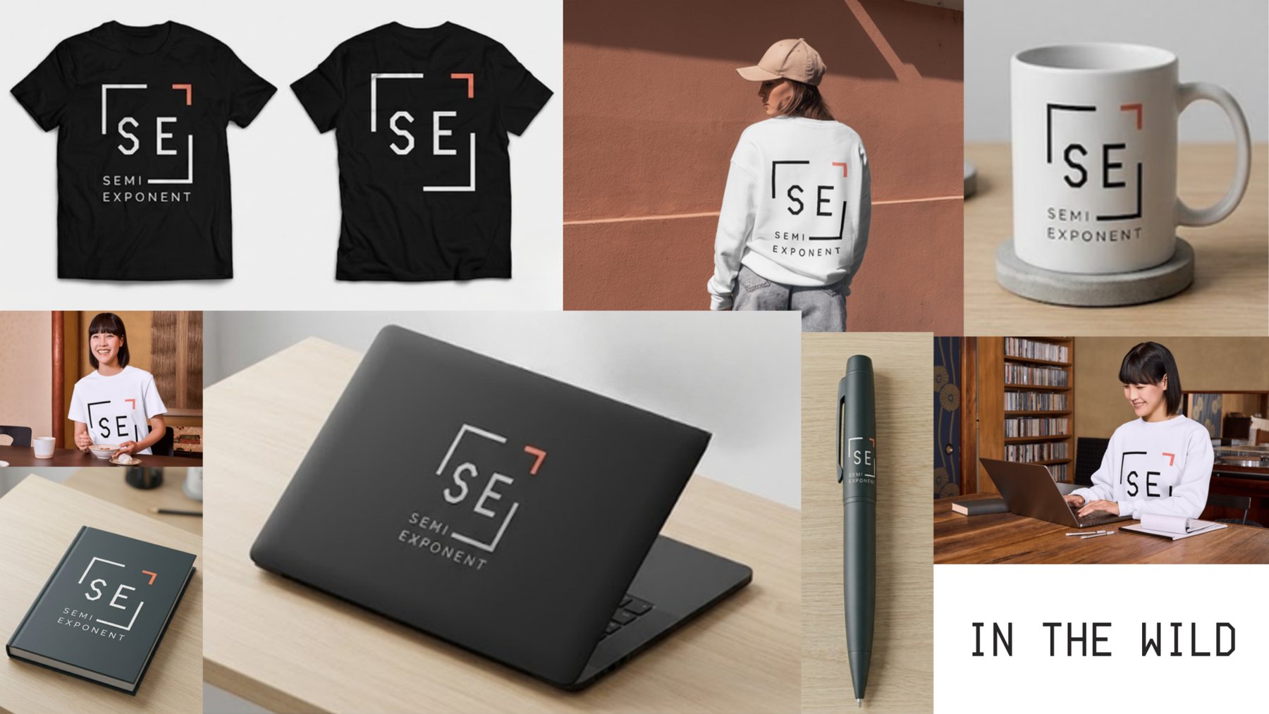
Tees, mugs, laptops, pens.
The SE frame is compact enough to stamp on anything, and still recognisable without the wordmark.
Website
Website, report store and admin panel.
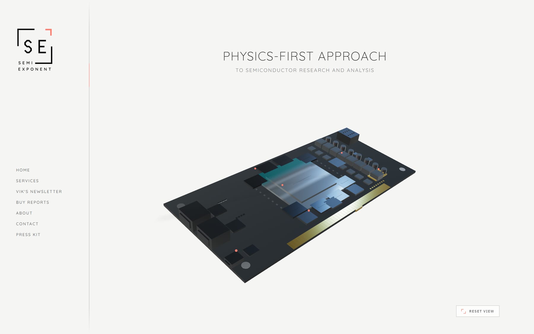
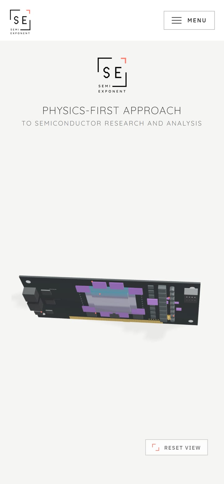
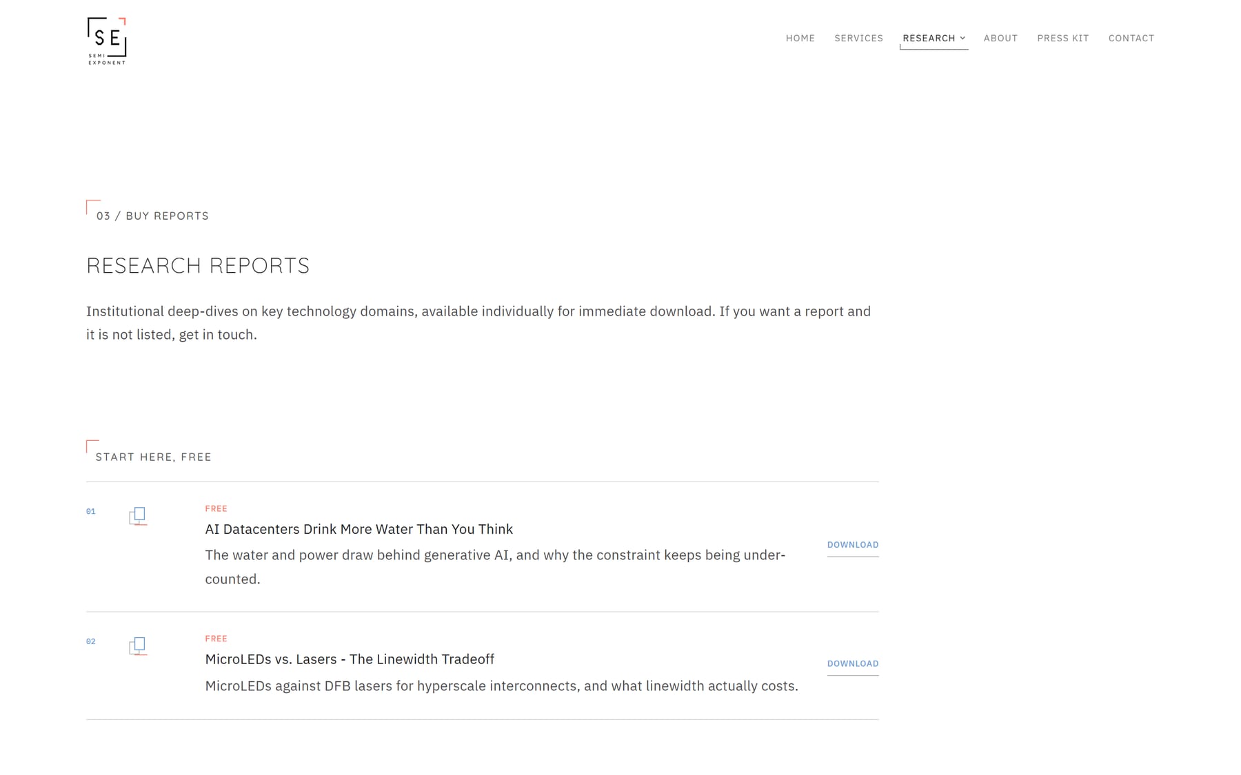
The home page is a 3D circuit board, and each part of the board links to a page. The firm’s existing report store is listed in the site’s own design, with checkout still handled by the store. An admin panel lets the team edit the copy themselves without touching the layout.