Process
What the client experience is like.
01
Listen, and keep it fun.
It starts with a short questionnaire the client fills in at their own pace. I come back with moodboards, not more questions.
Week 1
02
Find a vibe.
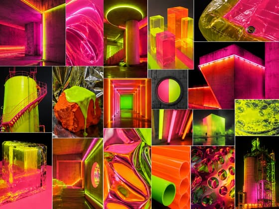
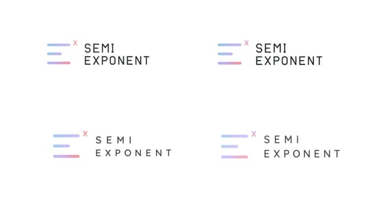
Four moodboards, A to D, to agree on a look before any logo is drawn. The client’s operations head asked for neon colours, just for fun, so I made them a hidden easter-egg page.
Week 1
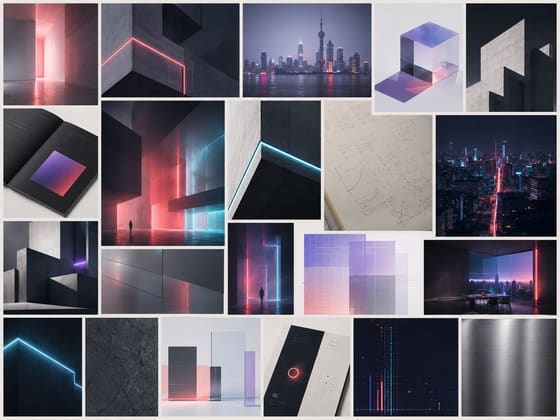
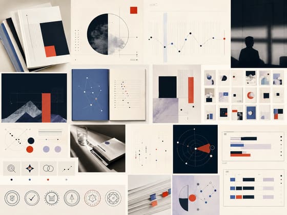

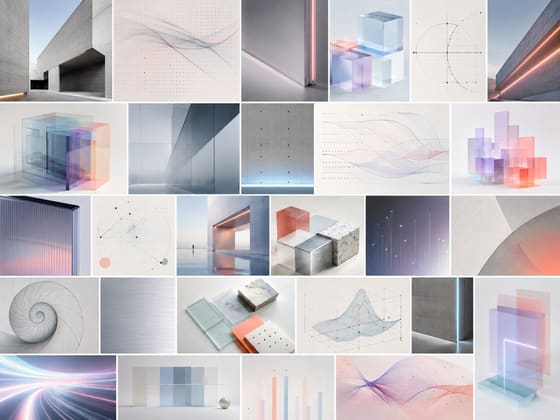
A moodboard is not the final design. It’s a visual reference to help us choose the overall vibe. Just tell me:
- Which one feels most like you?
- Which one feels least like you?
- Anything you strongly like in the others?
03
Logo options, with a recommendation.
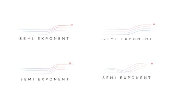
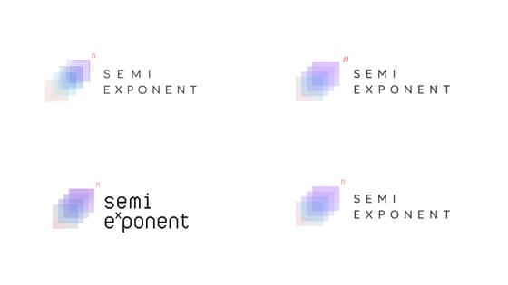
Four logo routes, each with sketches explaining the idea, and my own recommendation. The client chose the same one.
Week 2


04
The brand document.
Logo, colour, type and usage in one document. Once it was approved, every file went into a shared folder with a quick reference. When the founder asked how the brand should sit with his newsletter, I advised keeping them separate.
Weeks 2–5
Thinking aloud:
- Keep the newsletter as it is. It’s your voice, and the front door to the firm.
- Connect them in the footer: written by you, founder of the firm.
- Use the firm’s branding fully on reports, decks, cards and signatures.
05
Cards, then the website.
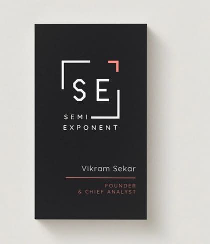
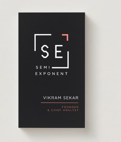
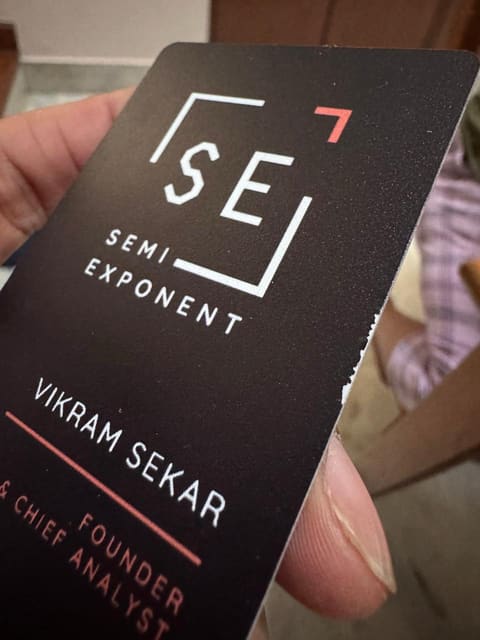
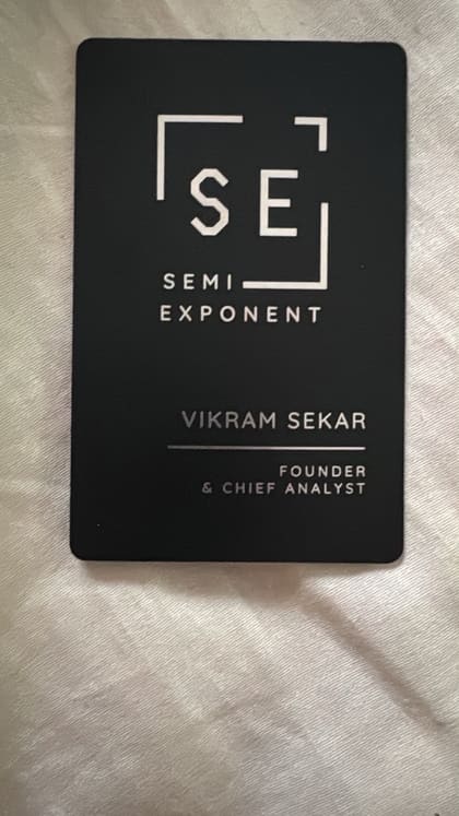
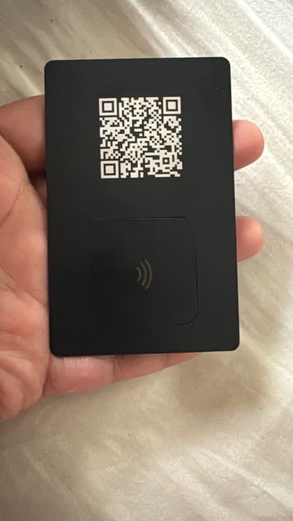
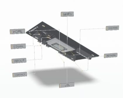
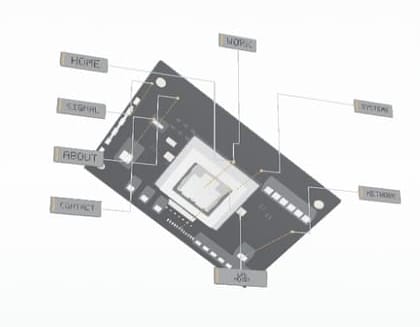
Business cards came first, before an overseas trip: a few options with my recommendation, and a fast replacement when the printed colour on the first metal card started peeling. Then the website. Its navigation is a 3D circuit board, refined with the client’s input. It went live the night he needed it for a show, and his existing report store was connected to it.
Weeks 3–14
For the NFC card: metal ₹1,999, PVC ₹999, wood ₹1,499.
Black metal looks super premium, and it works for your niche. Wood doesn’t work for your brand.
Pick a vibe, I’ll tell you which one corresponds to it:
- Dynamic
- Professional, committed
- Conventional, safe, reliable

Store
- Old links to the store now redirect properly.
- A new Buy Reports page lists all 25 reports in the site’s own design, free ones first. Checkout is still handled by the existing store.
06
An admin panel, so the client is in control.
The firm was being repositioned towards financial institutions, so the website copy would change more than once, and the client wanted to make those edits themselves. I built an admin panel with safeguards, so edits can’t break the site.
Weeks 13–24
How to use the admin panel
Pick a page, type, press Preview, then Publish. Some things to help you breathe easy:
- Nothing goes live until you press Publish.
- It won’t publish a broken page.
- Every version is saved.
- The layout, menu and 3D board can’t be changed from here, so nothing can break the design.
07
Stay on for what comes next.
I’m on a monthly retainer for amends, support and new features. The next one is already built: a private area for institutional reports, ready before the first client signs on.
Ongoing
For the institutional reports:
- Does every approved client see every report, or do you pick which reports each client gets?
- Should they appear in the menu, or stay unlisted? I’d recommend unlisted, with a link from the Services page.
Time goes into understanding the client from the start, so there are no unnecessary meetings later on.
Every option comes with my recommendation and the reason for it.
When something goes wrong, it gets fixed fast: the faulty card was replaced in two days, and the site went live the same night it was needed.
I handle vendors and deployments, and give the client tools to make their own edits.
Messages are trimmed and lightly edited for length; names, contact details and links are removed.