Brand Identity · SemiExponent

Physics-first semiconductor research and analysis, for technology investors and chip companies.
Overview
The brief
A research house that reads chips from the physics up.
SemiExponent publishes semiconductor research and analysis for technology-focused investors and semiconductor companies. The identity needed to feel technical and precise without going cold: engineered enough for an analyst’s desk, with enough spark to signal growth.
The mark
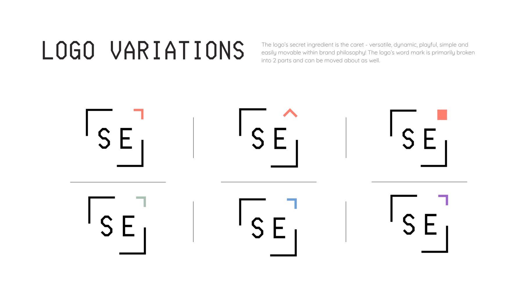
Chip and caret.
The idea behind the logo is the die, or chip, frame which expands to make room for the exponent. In one of the animated variants, the caret grows into a fully formed solid rectangle, the way a wafer grows from bottom to top.
Anatomy
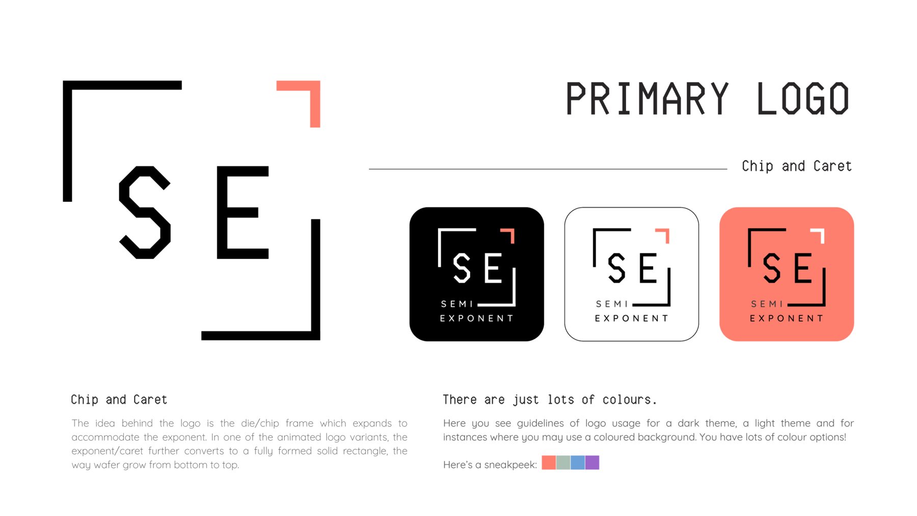
Every stroke is doing a job.
Built from simple, repeatable elements so it holds up across contexts and formats: technical, contemporary, timeless.
Logo variations
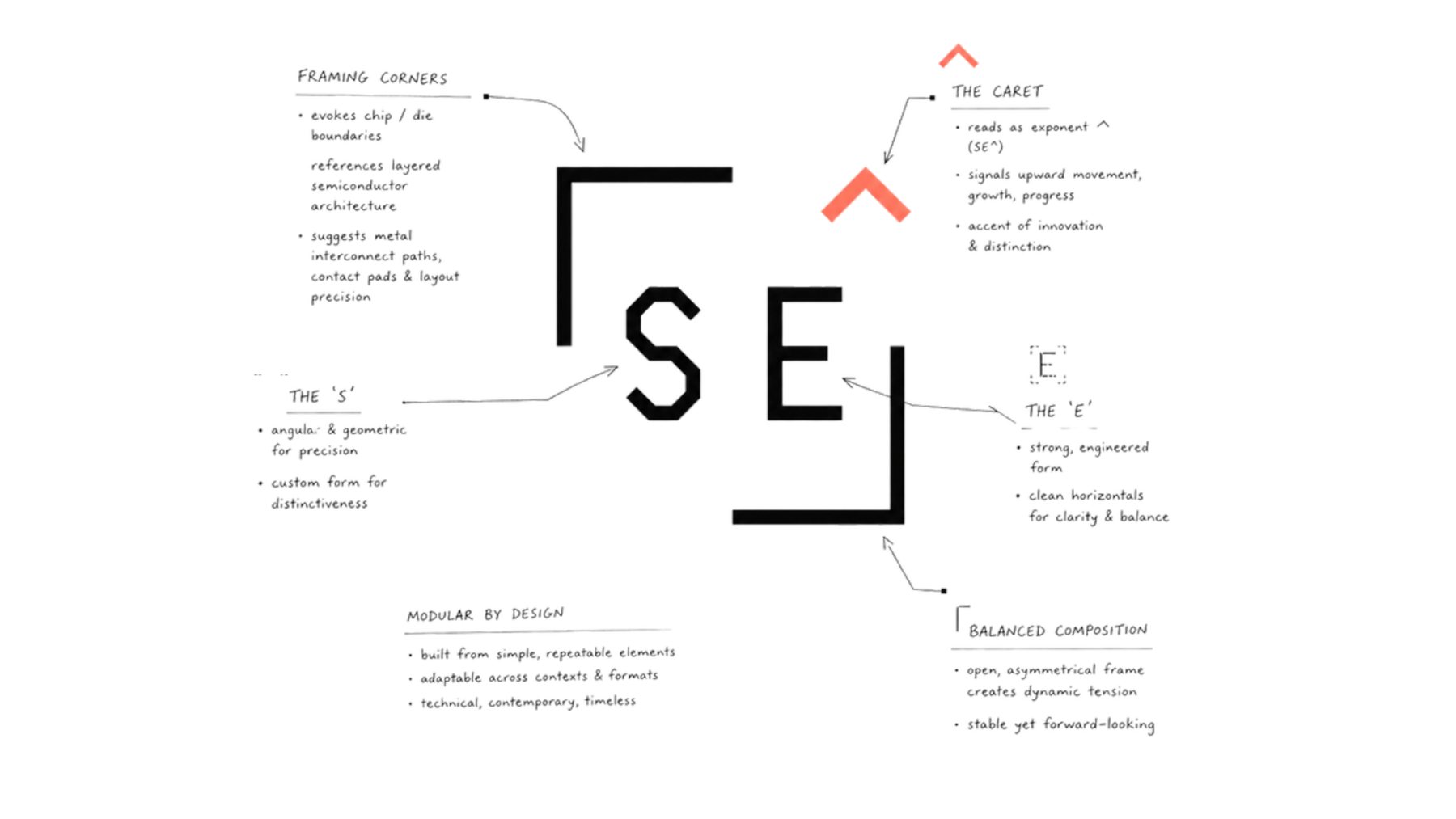
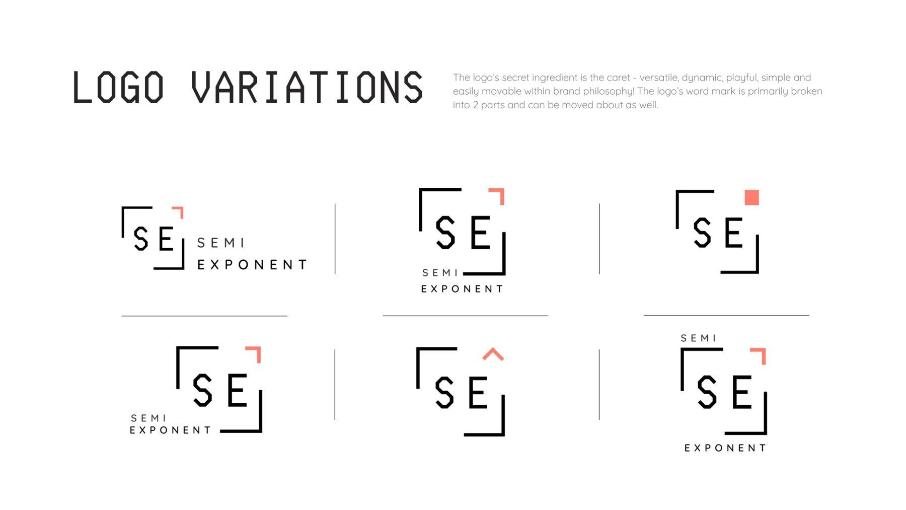
The caret is the secret ingredient.
Versatile, dynamic and playful, the caret can flip, fill, shift colour or become a solid chip. The wordmark breaks into two parts, SEMI and EXPONENT, and moves around the frame as the layout needs.
Colour
Charcoal and white, with a coral spark.
The mark works on a dark theme, a light theme or a coloured ground. Coral leads as the caret colour; sage, blue and violet give the system room to play.
Typography
A computer voice, softened.
The primary face is Computer Says No, a classic PC-inspired sans: if your computer could speak to you, this is the font it would use. Geo, a simple geometric face in the mould of 1920s modernism, is its open-source alternative. Quicksand, with its rounded terminals, carries body copy and keeps the system approachable.
v w x y z 1 2 3 4 5 6 7 8 9 0 & % $ !
v w x y z 1 2 3 4 5 6 7 8 9 0 & % $ !
Stationery & signage
From an NFC card to the office wall.
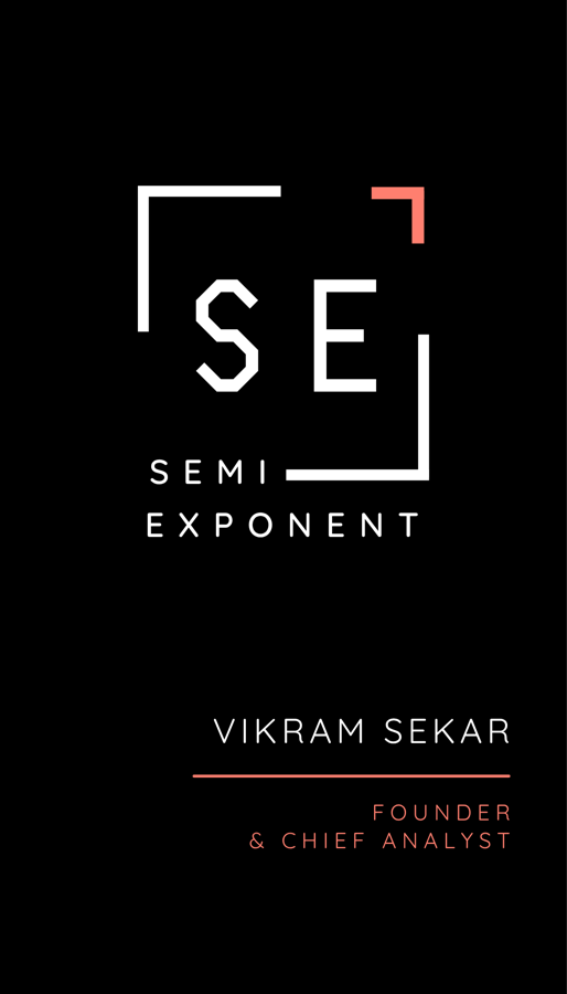
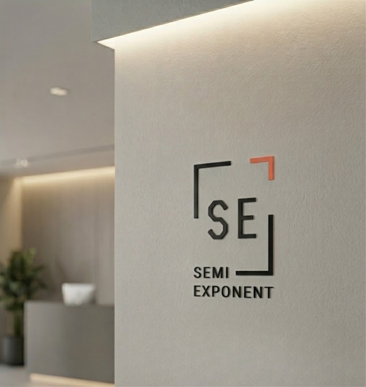
An NFC business card on charcoal, and the mark scaled up as dimensional wall signage. The frame reads just as clearly at both sizes.
In the wild
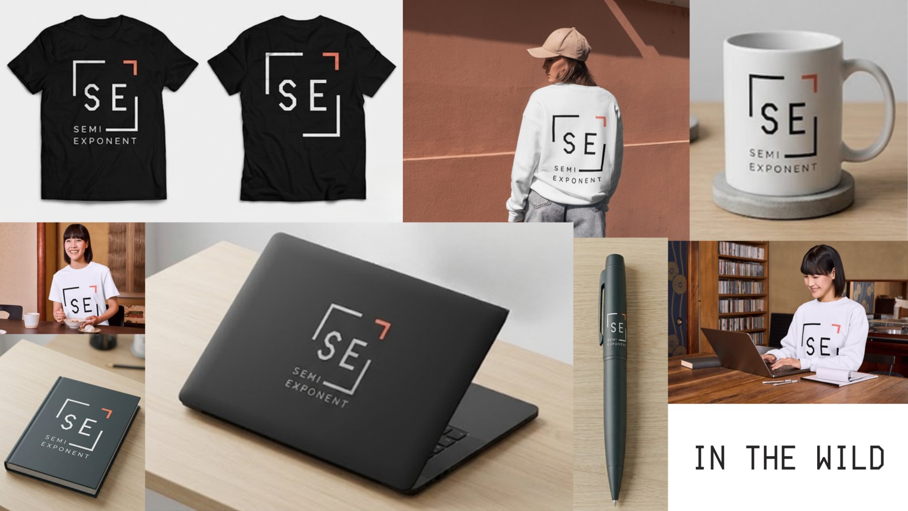
Tees, mugs, laptops, pens.
The SE frame is compact enough to stamp on anything, and still recognisable without the wordmark.