00Brand identity · National Montessori Conference
Prakṛti
01The brief
Derived from nature.
Rooted in science.
- Problem
- The 6th National Montessori Conference needed one identity that spoke to educators and children, across print, digital and the event itself.
- Needed
- Logo, colour and type, posters, social media, identity badges, bookmarks and the web pages.
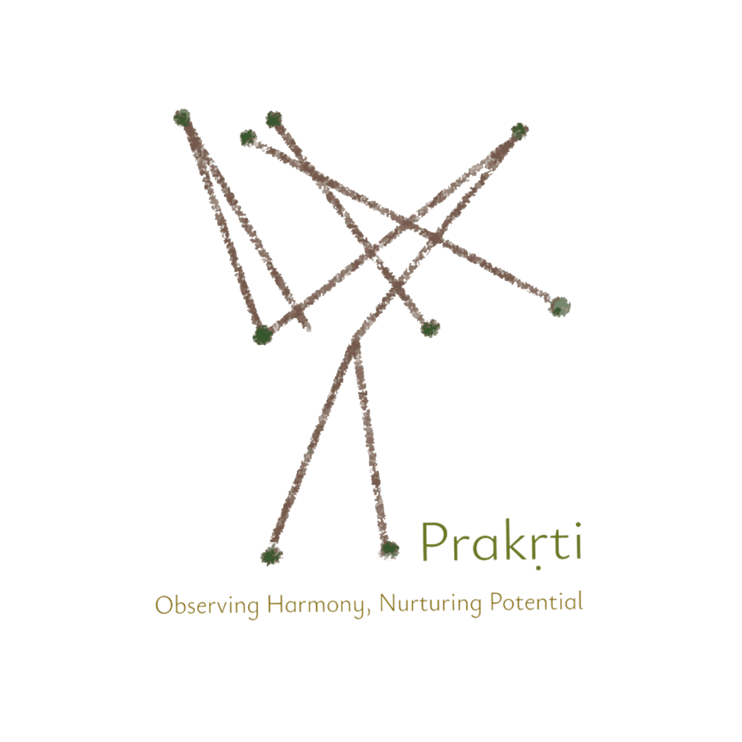
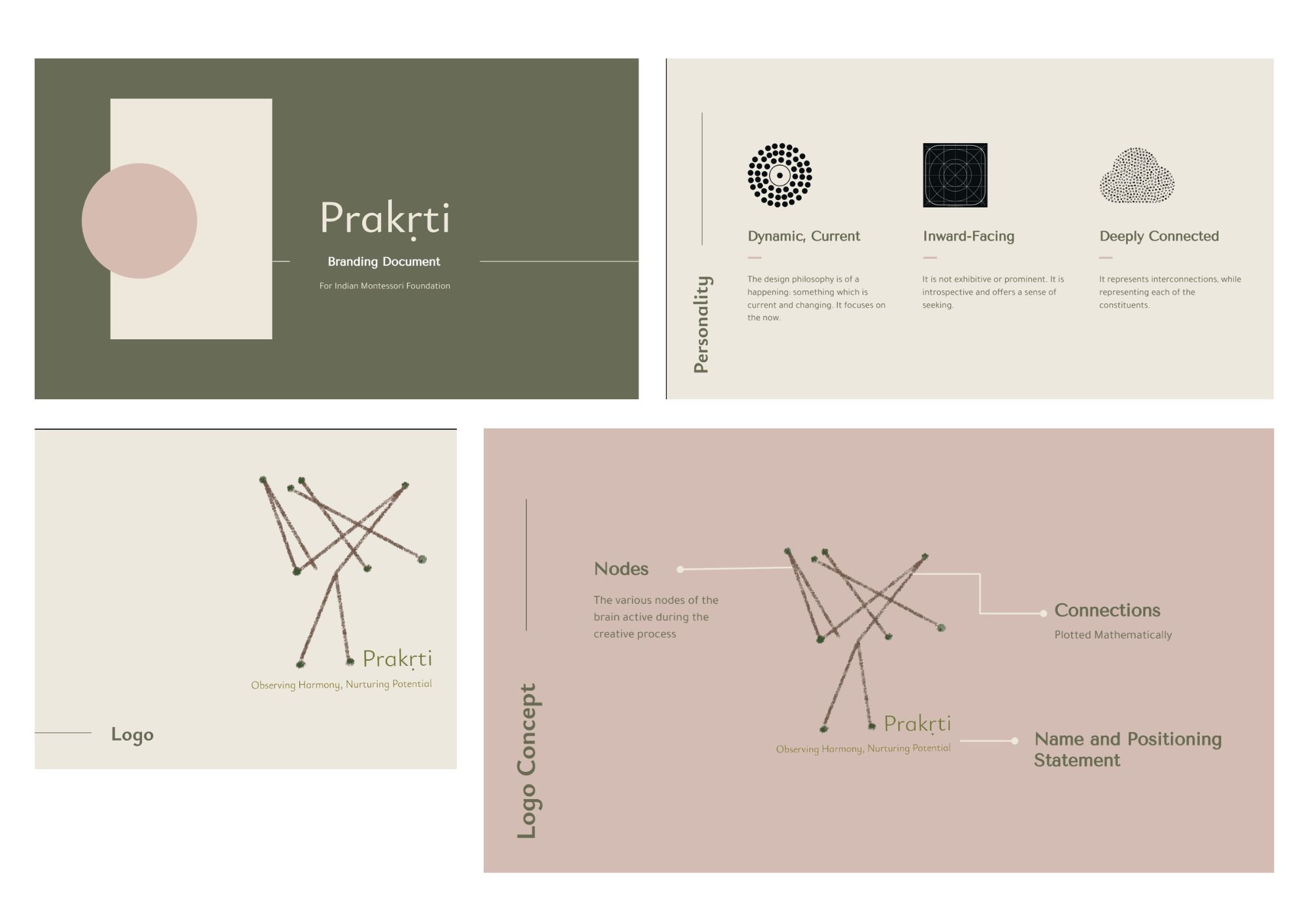
Prakṛti (Sanskrit for nature) was the theme of the 6th National Montessori Conference. The design decisions trace back to neuroscience: the logo maps the brain regions active during creative work, plotted from research data. Crayon textures speak to children; earth tones tie it to nature.
02The mark
A map of
the creative mind.
Each node in the mark represents one of those centres. Each line is a mathematically-plotted connection between them - tracing the exact patterns observed in the data (note below).
hover over the nodes to reveal the brain centres active during the creative process
03Colour system
Earthy. Warm. Raw.
Forest, soil and parchment: a palette taken from nature.
04Typography
Typography.
Tenor Sans for headings; Tajawal for body text.
O P Q R S T U V W X Y Z
a b c d e f g h i j k l m n o p q r s t u v w x y z
O P Q R S T U V W X Y Z
a b c d e f g h i j k l m n o p q r s t u v w x y z
05Posters
The conference,
alive.
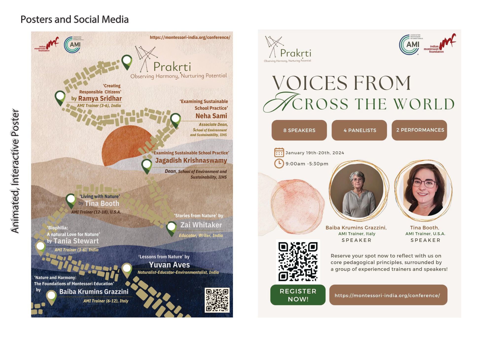
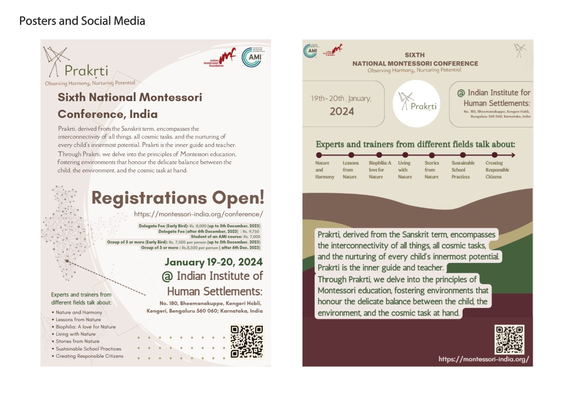
An interactive digital brochure and large-format registration posters.
06Social media
Social media.
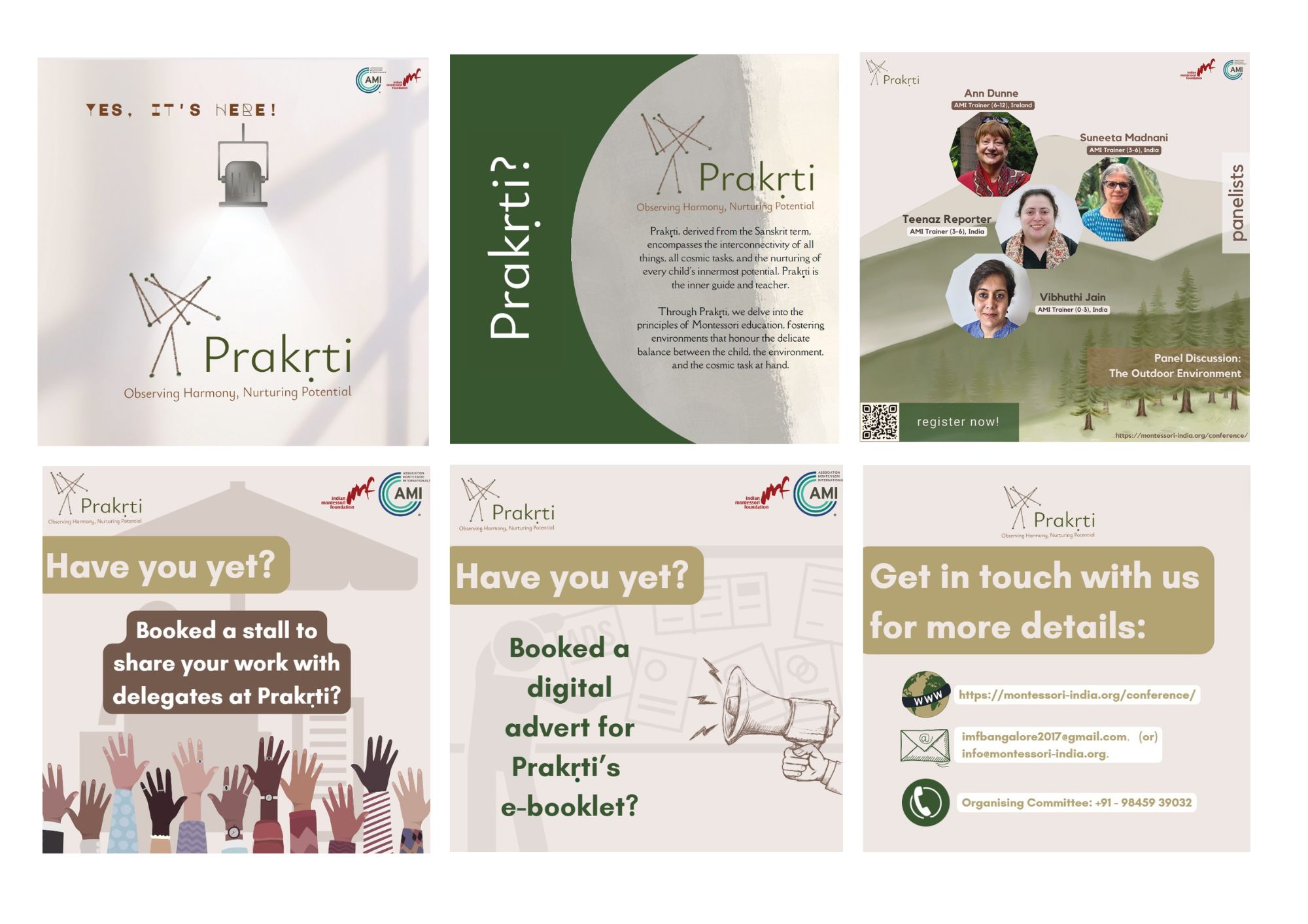
Instagram posts for the conference: announcements, speaker spotlights, stall bookings and contact details.
07Identity badges
Badges.
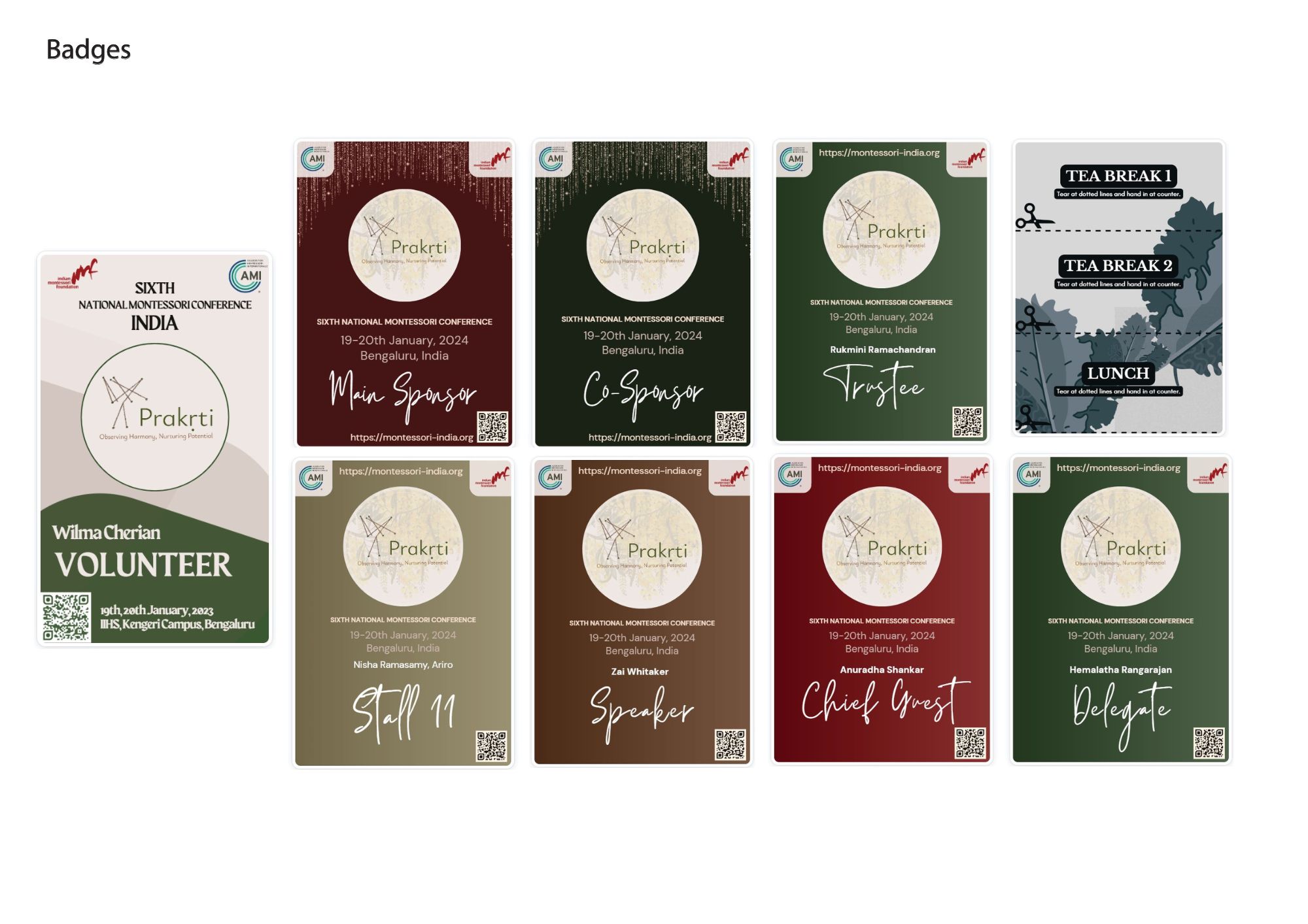
Ten badge types (volunteer, sponsor, trustee, staff, speaker, chief guest, delegate and more), each with its own colour within the system.
08Bookmarks
Something to keep.
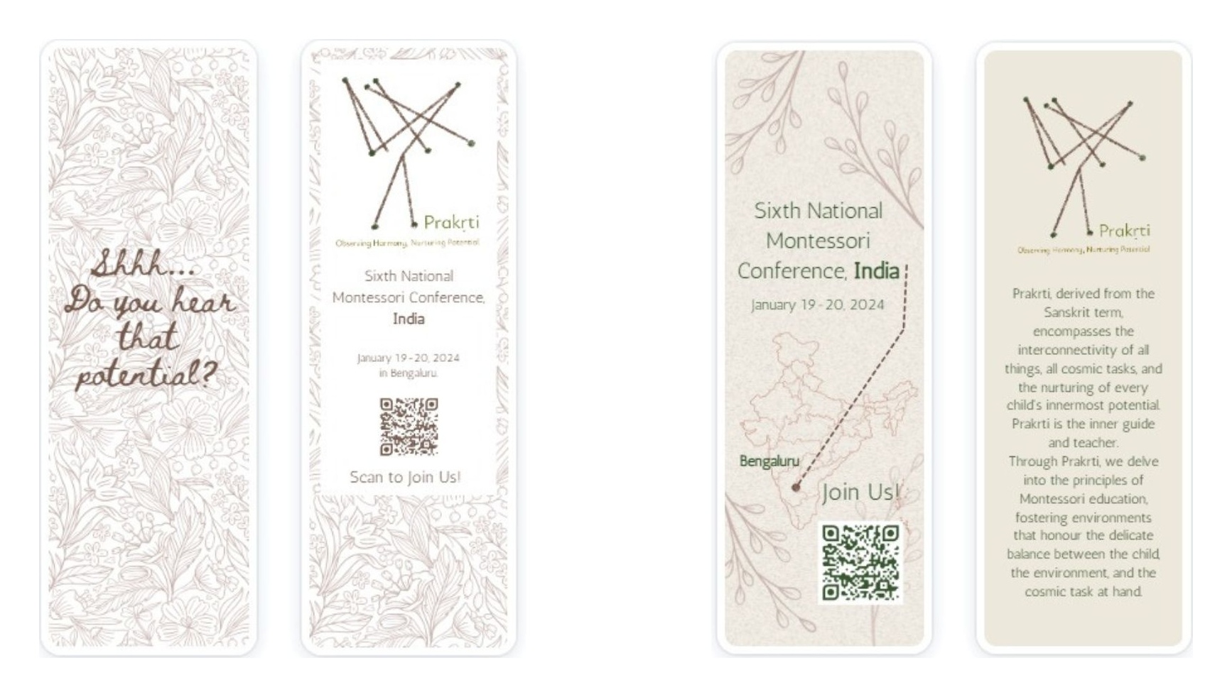
Handout bookmarks for conference attendees and for publicity pre-event - two styles, front and back. One side in botanical crayon illustration, speaking to children. The other in clean brand type, with the conference details and a map to Bengaluru.
“Shhh... do you hear that potential?”
09Web
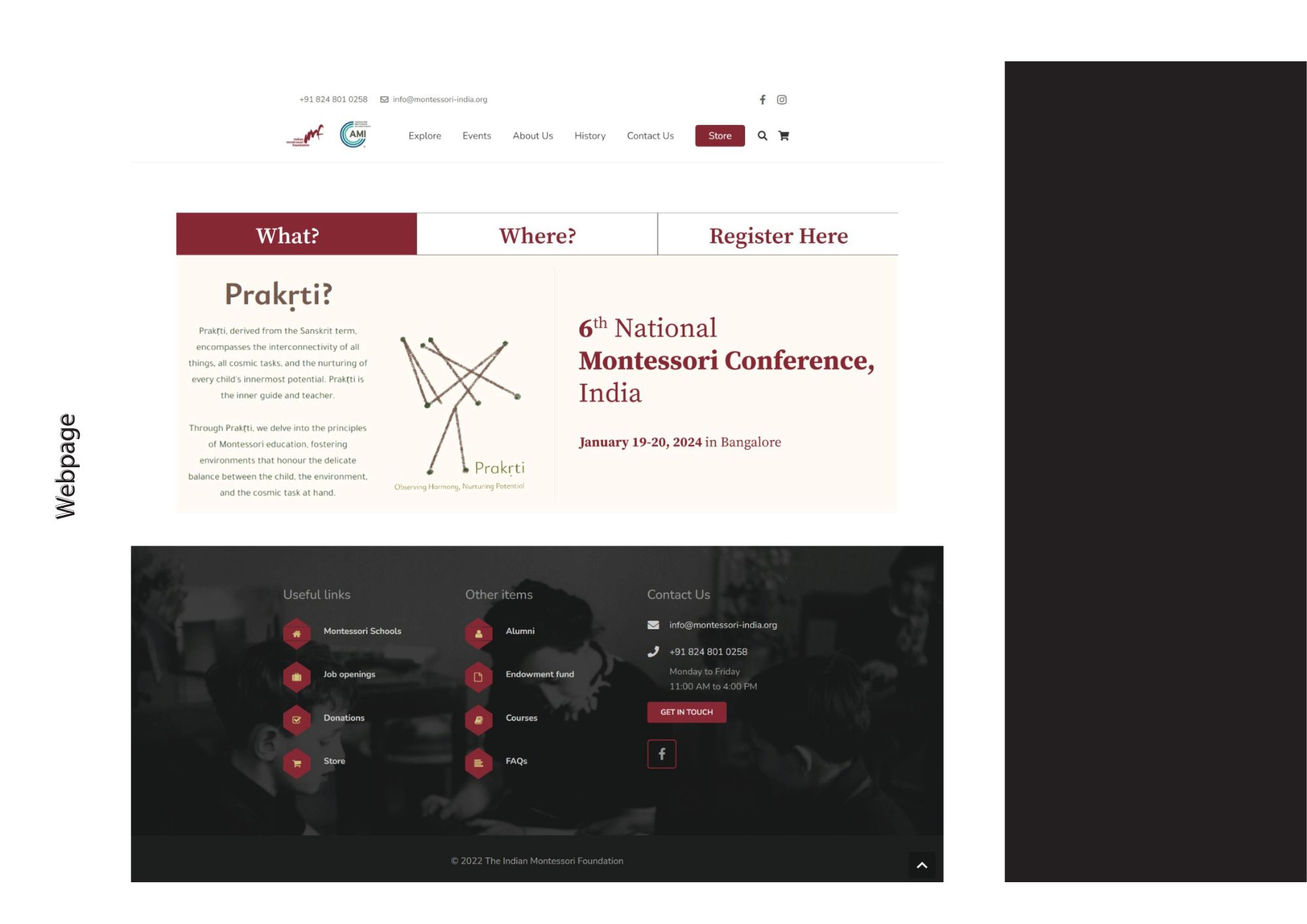
The conference,
online.
A dedicated conference page on the Indian Montessori Foundation website: What?, Where?, Register Here. It follows the existing site’s layout, with the conference branding.