Brand Identity · Mysore · 2024
Reeva
Education for Life
The Brief
A school with a soul.
Reeva is a Montessori school in Mysore that believes in education as an aid to life. The brief was to build an identity that matched that philosophy: handmade-feeling, warm, rooted in the local, and alive with detail. Everything from the logo to the signboard on the wall was built from scratch.
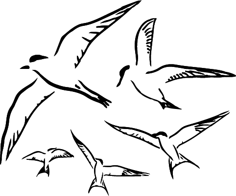
The Mark
Birds in flight.
Scalable vector.
A flock of hand-drawn birds: terns, in full motion. The mark is drawn rather than constructed, giving it a warmth no geometric logo could carry. It works at any scale from a letterhead stamp to a 4-foot steel signboard.
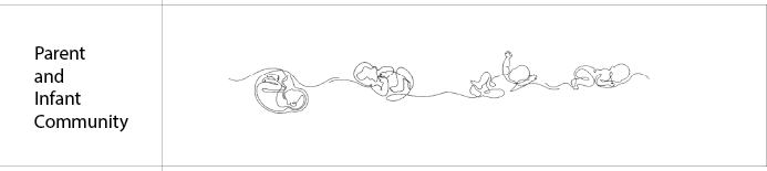
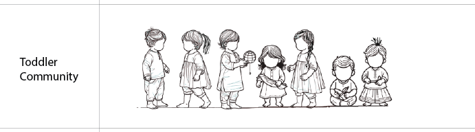
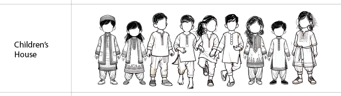
Custom Illustrations
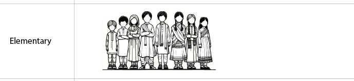
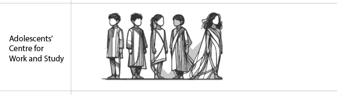
The people of Reeva, drawn from life.
Every age-group got its own illustration for the website banners, hand-drawn in contemporary Indian clothes, at different life stages. The progression was the brief: show the full arc of growing up at Reeva.
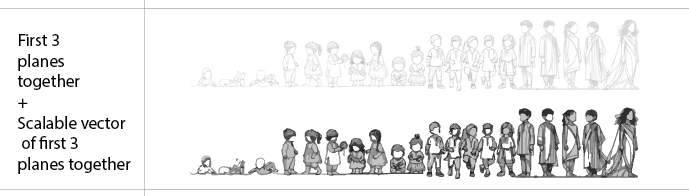
drag, scroll, or use the arrows to explore
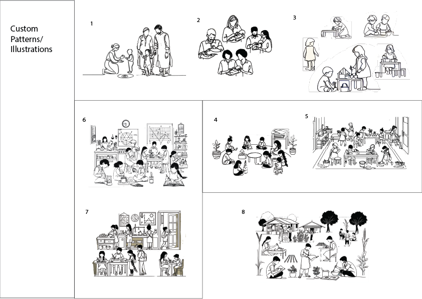
Scene Illustrations
Life at Reeva, eight scenes.
A set of eight interior illustrations: children working, reading, gathering. Each one pen-drawn, then vectorised.
Colour Palette
Warm earth.
Cool water.
The palette is rooted in the outdoors: the olive and cream of dry grass, the teal of still water. Click a swatch to paint the page and pick it up on the drawing board below.
Typography
Four voices.
One school.
Two scripts, four typefaces, from the organic imprecision of Lumios Typewriter to the formality of Averia Serif Libre. Noto Sans Kannada carries the Kannada script with the same weight and care as the Latin.
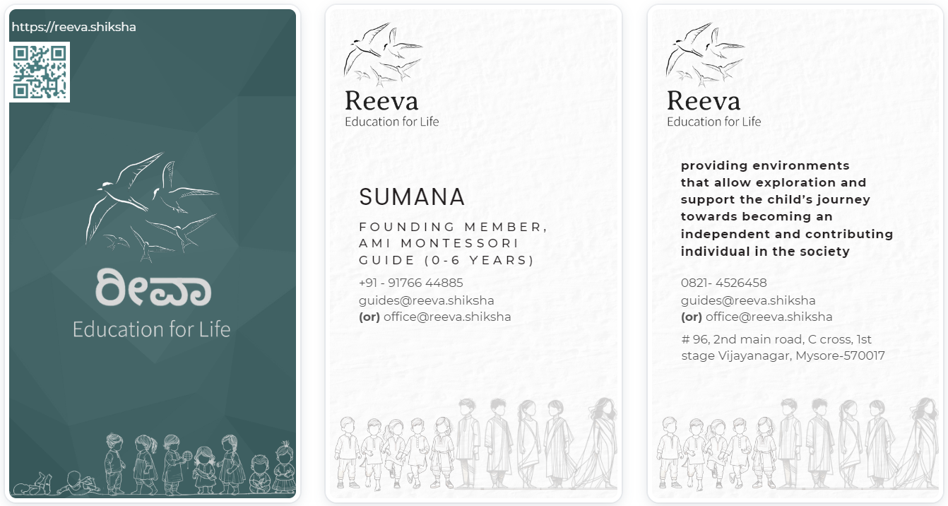
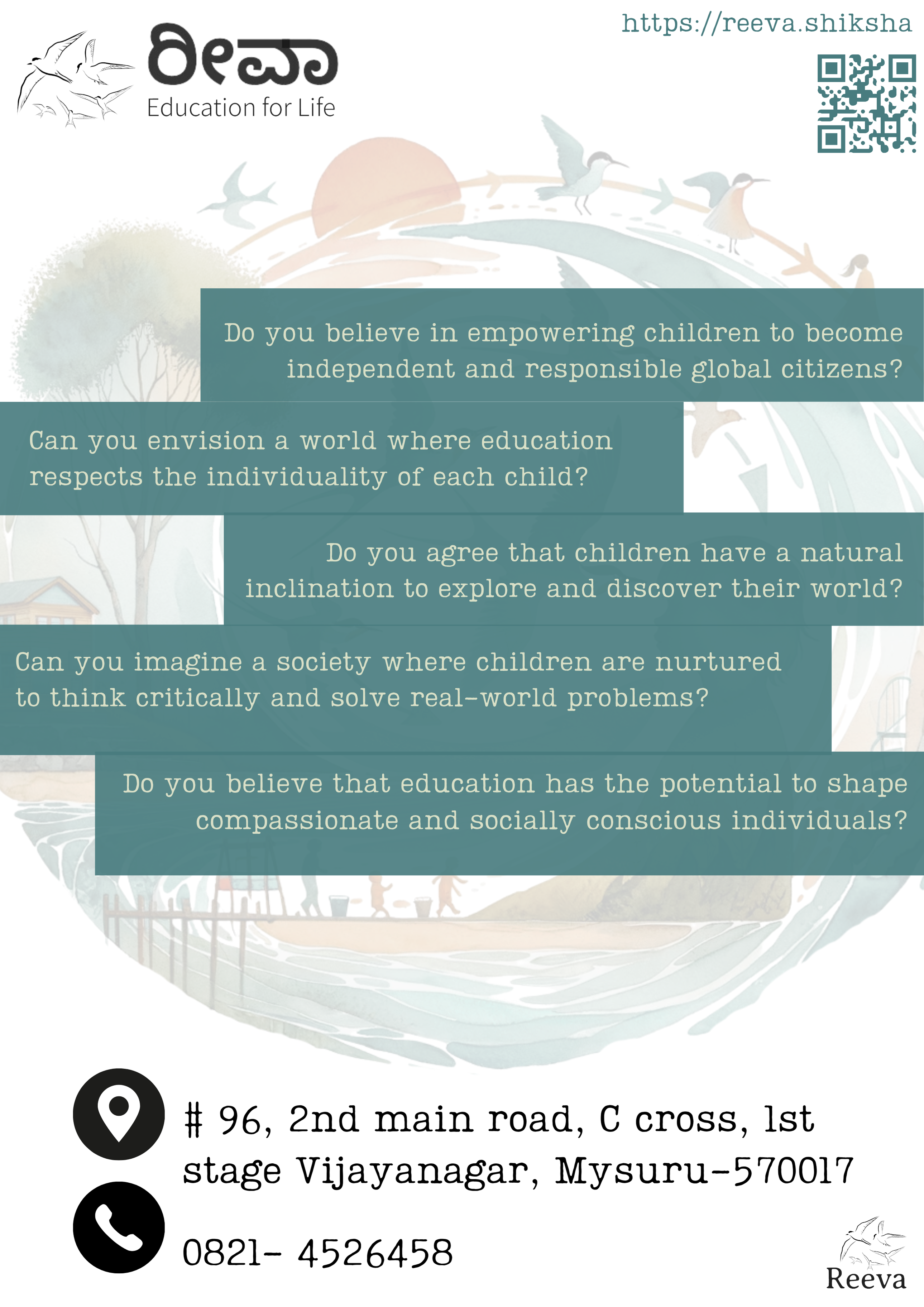
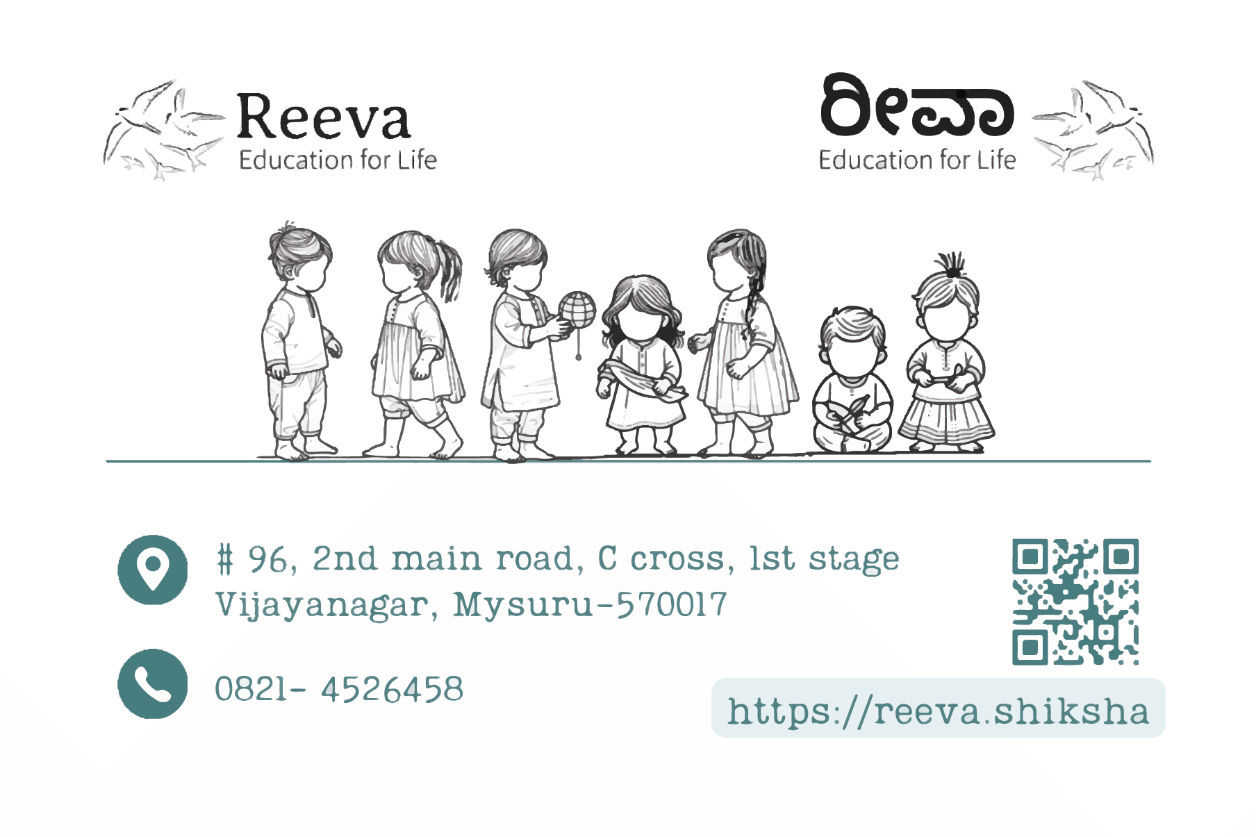
Printed Collateral
Every surface,
considered.
The brand touches everything physical that the school engages through - letterhead, envelopes, visiting cards, bookmarks, and open-house posters. Each piece carries the illustrations and typographic system consistently.
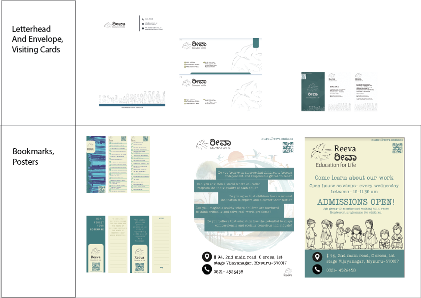
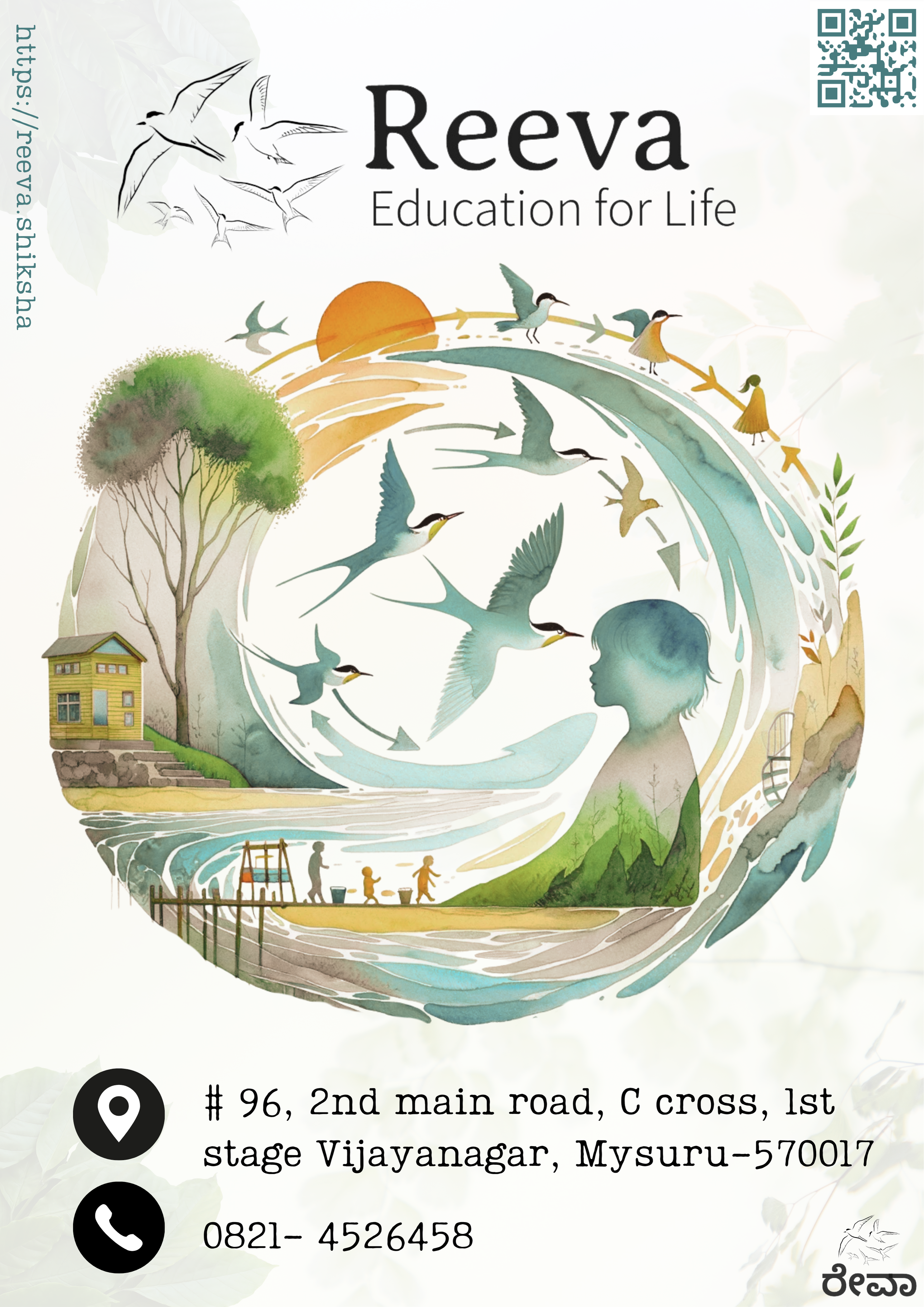
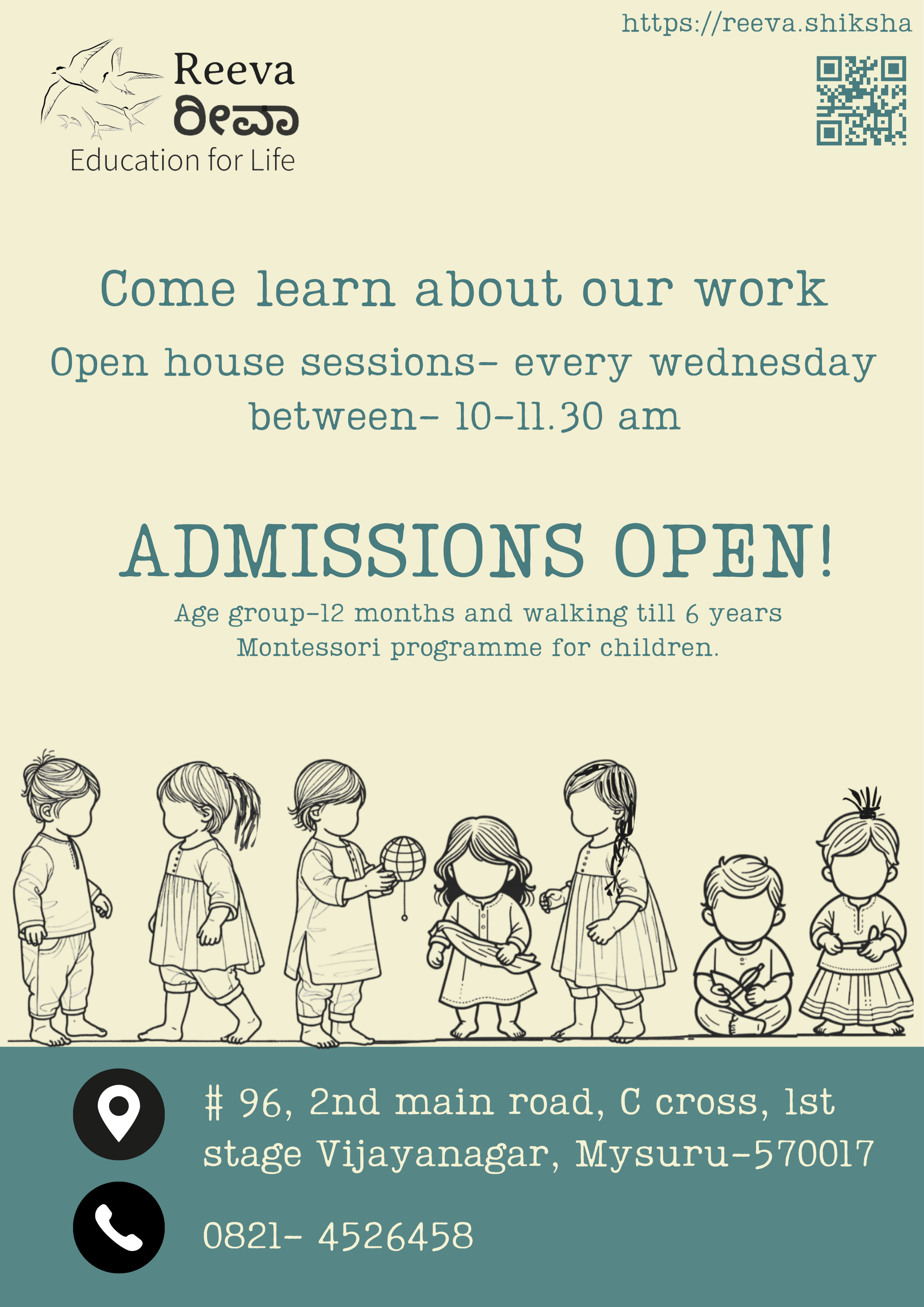
Bookmarks & Posters
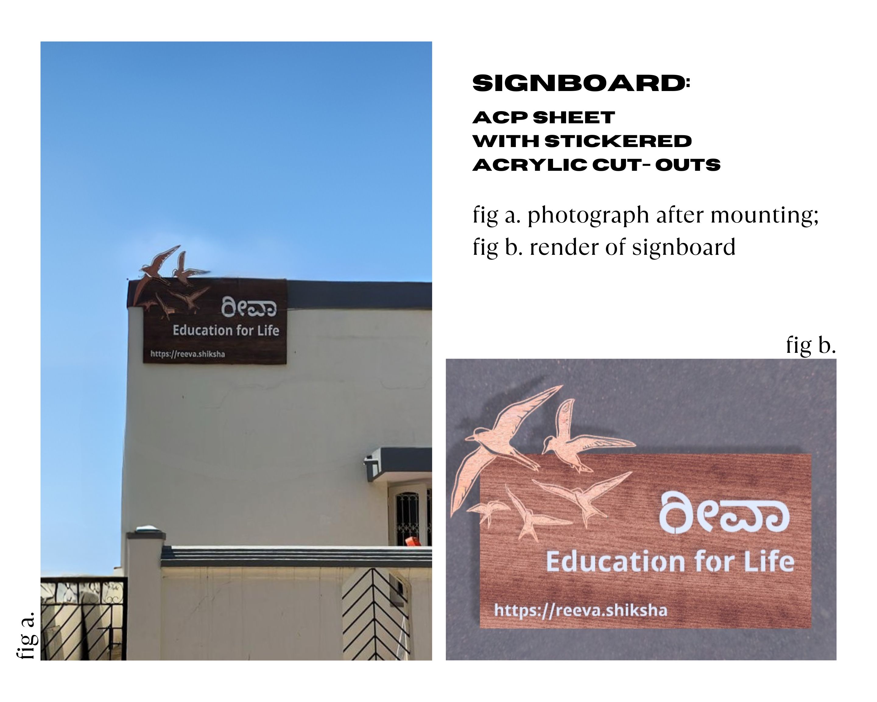
The Signboard
From vector to wall,
fabricated.
Designed as a scalable vector, then fabricated in wood and metal via CNC routing. The birds fly off the edge of the frame.
Banner
The full mark,
bilingual.
The outdoor banner carries both the English and Kannada wordmarks side by side, with the toddler illustration as the centrepiece. Built as a scalable vector for print at any size.
Website
Designed,
then built.
The identity didn't stop at print. The Reeva website was designed and built to carry the same warmth: custom illustrations, bilingual copy, and the brand's full typographic system throughout. Browse it live below.
Visit reeva.shiksha →