Brand identity · Oomune

Identity, packaging and website for a functional mushroom supplement brand.
Visit oomune.com ↗Overview
The brief
Look different in a crowded category, without looking jarring.
- Problem
- Supplements sell in a crowded category, more and more on quick-commerce apps, where buyers only see a photo of the pack and decide in seconds.
- Needed
- The identity, capsule and powder packaging, product images, quick-commerce listings and the website.
Oomune sells Cordyceps militaris as capsules and powder, direct to consumers online and through quick-commerce apps. The category is crowded, so the brand had to look different without looking jarring, and credible enough for something people take every day.
Before designing the pack, I ran a survey to find out what actually makes people trust a supplement. Its findings shaped the packaging below.
Research
A survey of supplement buyers, before designing the pack.
For my MBA research project, I surveyed people who buy wellness supplements on what makes them trust and choose one brand over another: packaging, credibility cues, health claims and positioning. Alongside rating questions, respondents chose between pairs of competing pack designs.
It was prompted by this brand. On quick-commerce apps nobody picks the pack up: they see a photo of it next to a price and a row of rivals, and decide in seconds.
found minimalist, information-led packaging appealing, and it was also the style trusted most (44.4%). Bright or artistic packs drew almost no one.
for transparent ingredient sourcing, the highest-rated trust factor. A transparent ingredient list was also the single strongest trust signal (30.6%).
chose the pack carrying a third-party certification over the same pack without one.
found a specific, evidence-backed claim more trustworthy than a generic one; 86% preferred a transparent label to a marketing-heavy one.
check health claims themselves at least sometimes. Only one person would simply believe “clinically proven”.
reach first for a “natural” brand, but name “scientific” as the positioning they trust most.
43 responses, 36 qualified, collected online in 2026. A small, non-random sample, so the findings are indicative. From Factors Influencing Consumer Preference for Wellness Supplement Brands, MBA research project, Symbiosis School for Online and Digital Learning, July 2026.
Research
What the findings changed.
- Inform, don’t decorate
- A clean, information-led label. The product name and the key facts lead; the symbol pattern stays in the background.
- Ingredients first
- “100% fruit filling” on the front, and the ingredient panel kept readable on the label.
- Specific claims
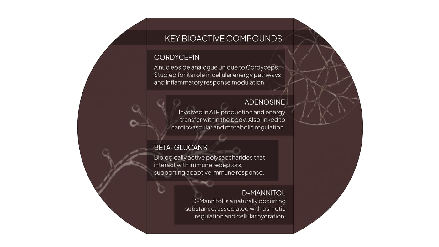
- The compounds are named (cordycepin, adenosine, beta-glucans, D-mannitol) instead of generic wellness promises.
- Proof people can check
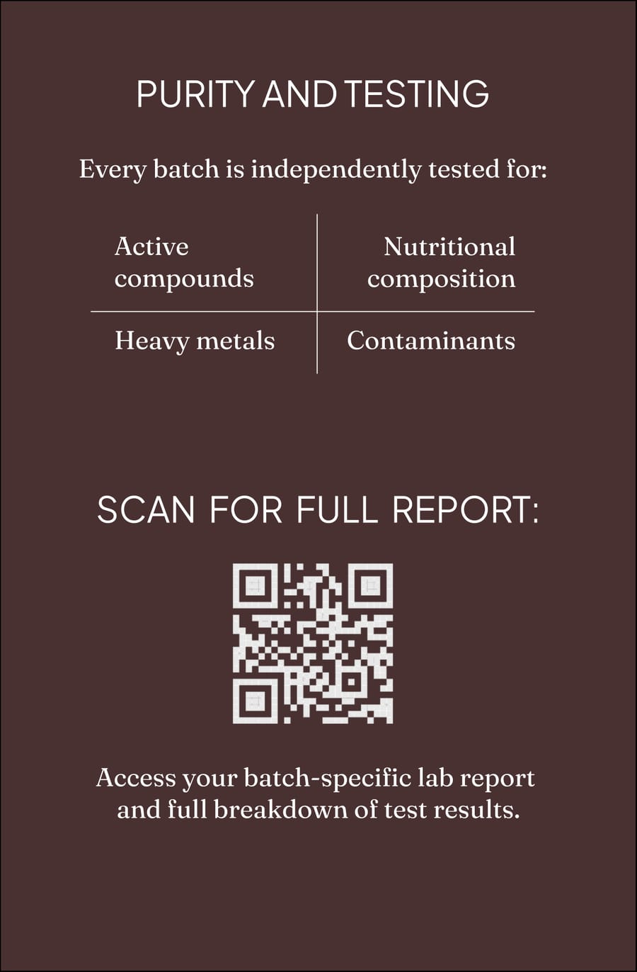
- A QR code to each batch’s lab report, on the lid (“Nothing hidden”) and on the purity panel inside the box.
- Certification
- The FSSAI licence on the box, and the vegan and non-GMO marks on the label.
- Natural and scientific
- Earthy colours and a hand-drawn cordyceps for the first reach; clean type and test data for trust.
Identity
Wordmark.
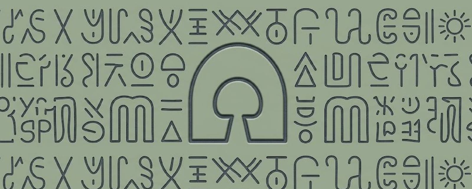
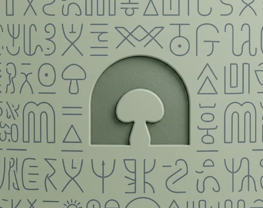
A rounded, geometric wordmark. The first o is drawn as an arch with a mushroom cut out of it, and that arch is reused on its own on the jar, the box and in the pattern.
Deep brown on off-white Reversed
 On sage
Identity
Pattern.
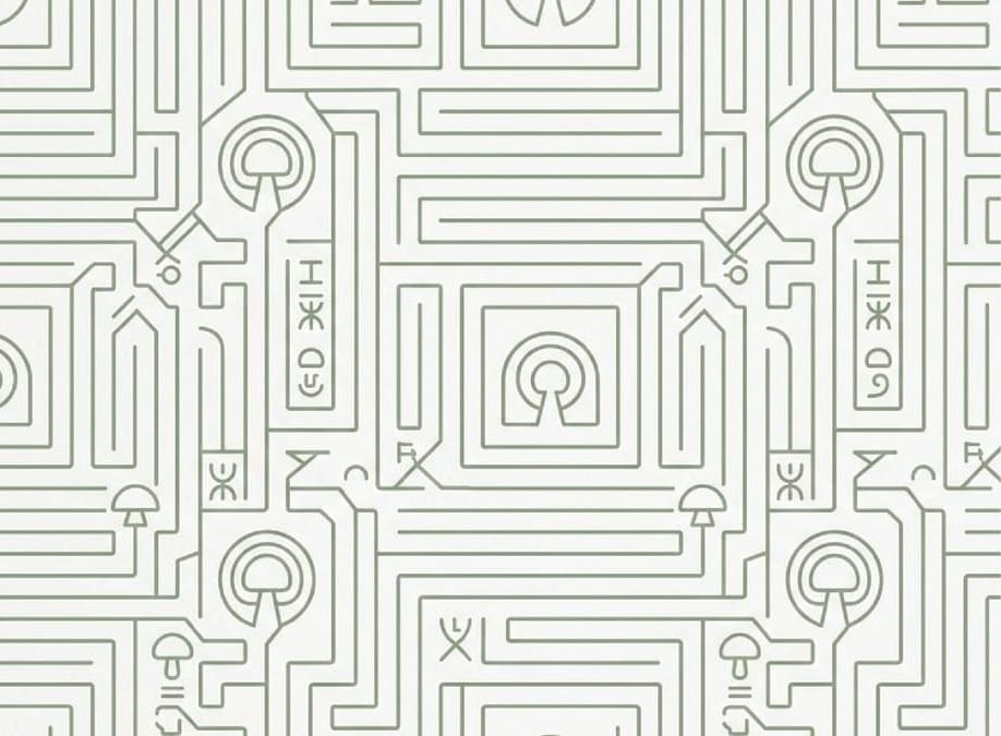
A field of symbols based on the Indus Valley Script, with the arch at its centre. It gives the brand a recognisable texture without adding another logo. It’s used flat on print, as a line pattern, and embossed on the jar.
Identity
Colour.
Six colours. Deep brown and clay for packaging and type; off-white and grey for backgrounds and the website; sage and navy as secondary accents.
Identity
Typography.
Fraunces for headings and product names. Plus Jakarta Sans for body text, labels, ingredient lists and the website interface.
V W X Y Z 1 2 3 4 5 6 7 8 9 0
v w x y z 1 2 3 4 5 6 7 8 9 0
Packaging
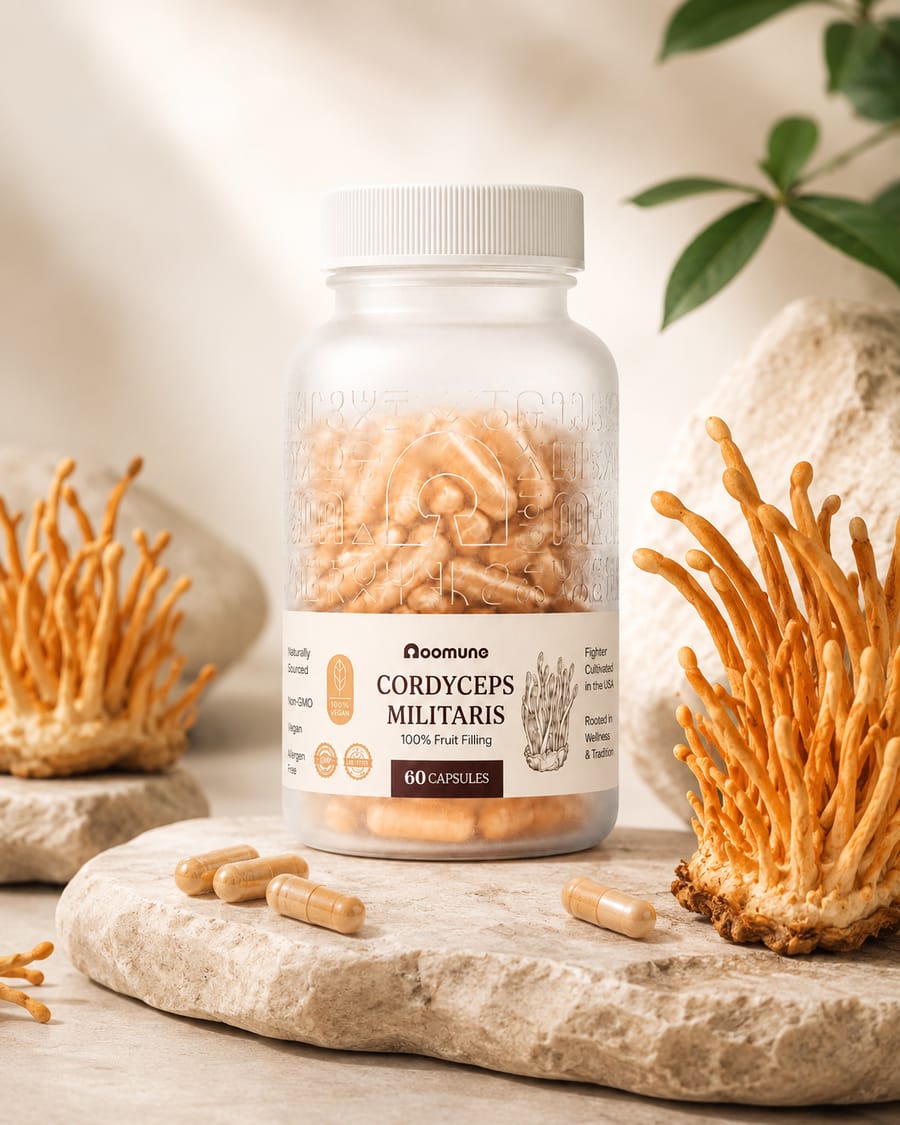
Capsule jar.
A frosted jar with the symbol pattern and the arch embossed around the upper half, so the capsules show through. The label carries the product name, the main claims and a cordyceps illustration.
Packaging
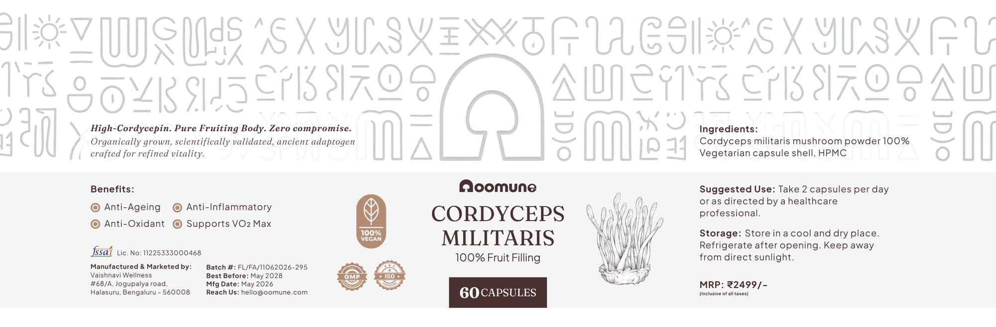
Label.
One wrap-around label. Left: benefits and certifications. Centre: the product name and capsule count. Right: ingredients, usage, storage and batch details.
Packaging
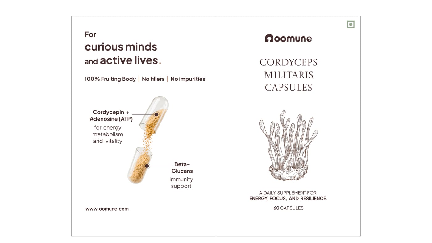
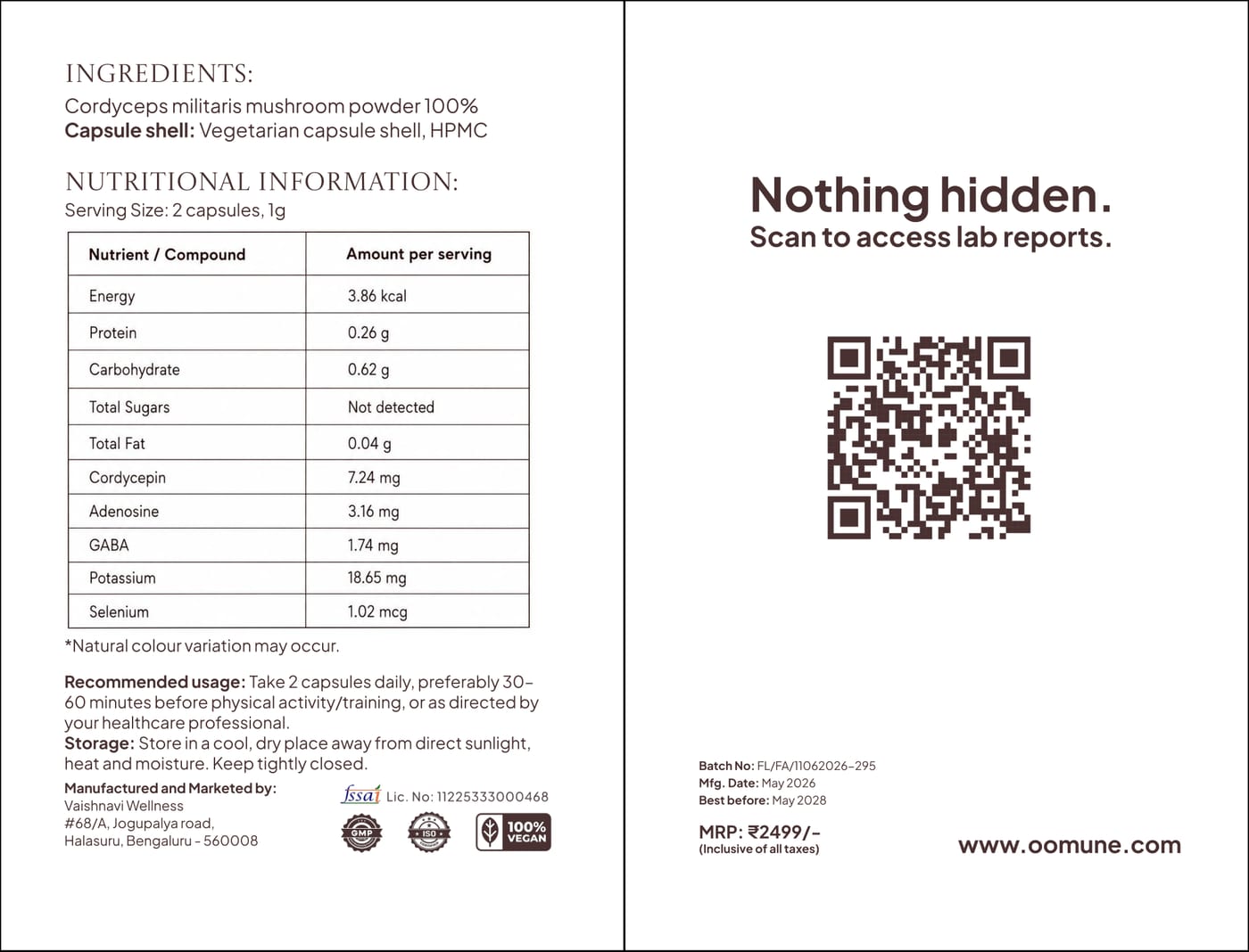
Box: lid.
A white lid slides over the box. The front panels say who it’s for and what’s in each capsule; the back carries the nutrition table and a QR code to the lab reports.
Packaging
Box: inner box.
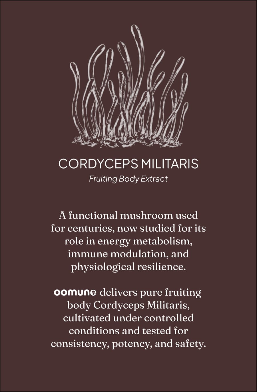
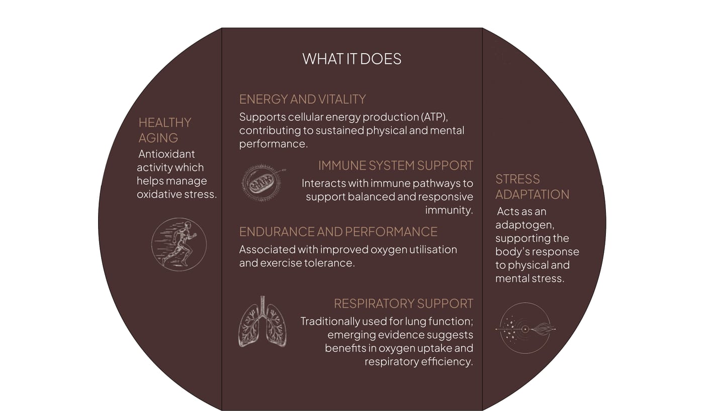
The inner box is printed in deep brown and doubles as the leaflet, so there is no separate insert to print: what Cordyceps militaris is, its key compounds, its benefits, and a purity panel with a QR code to the batch’s test report.
Packaging
Insert.
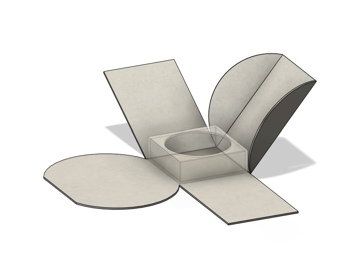
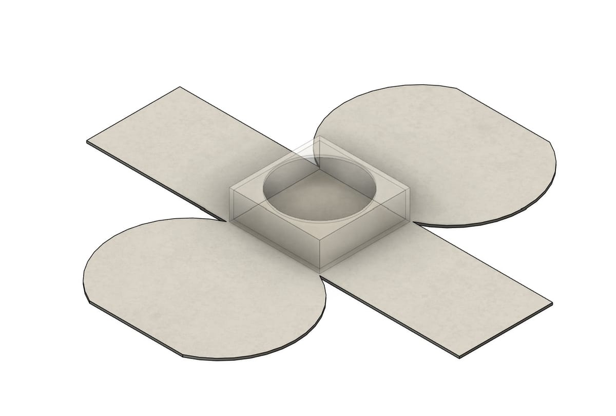
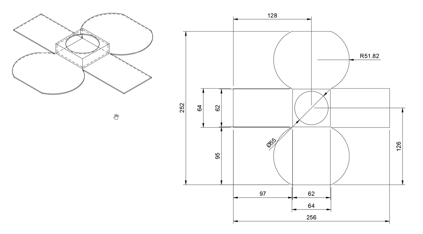
A single die-cut insert. A circular cradle holds the jar in place, and the two round flaps, which carry the compounds and the benefits, fold up around it.
Packaging
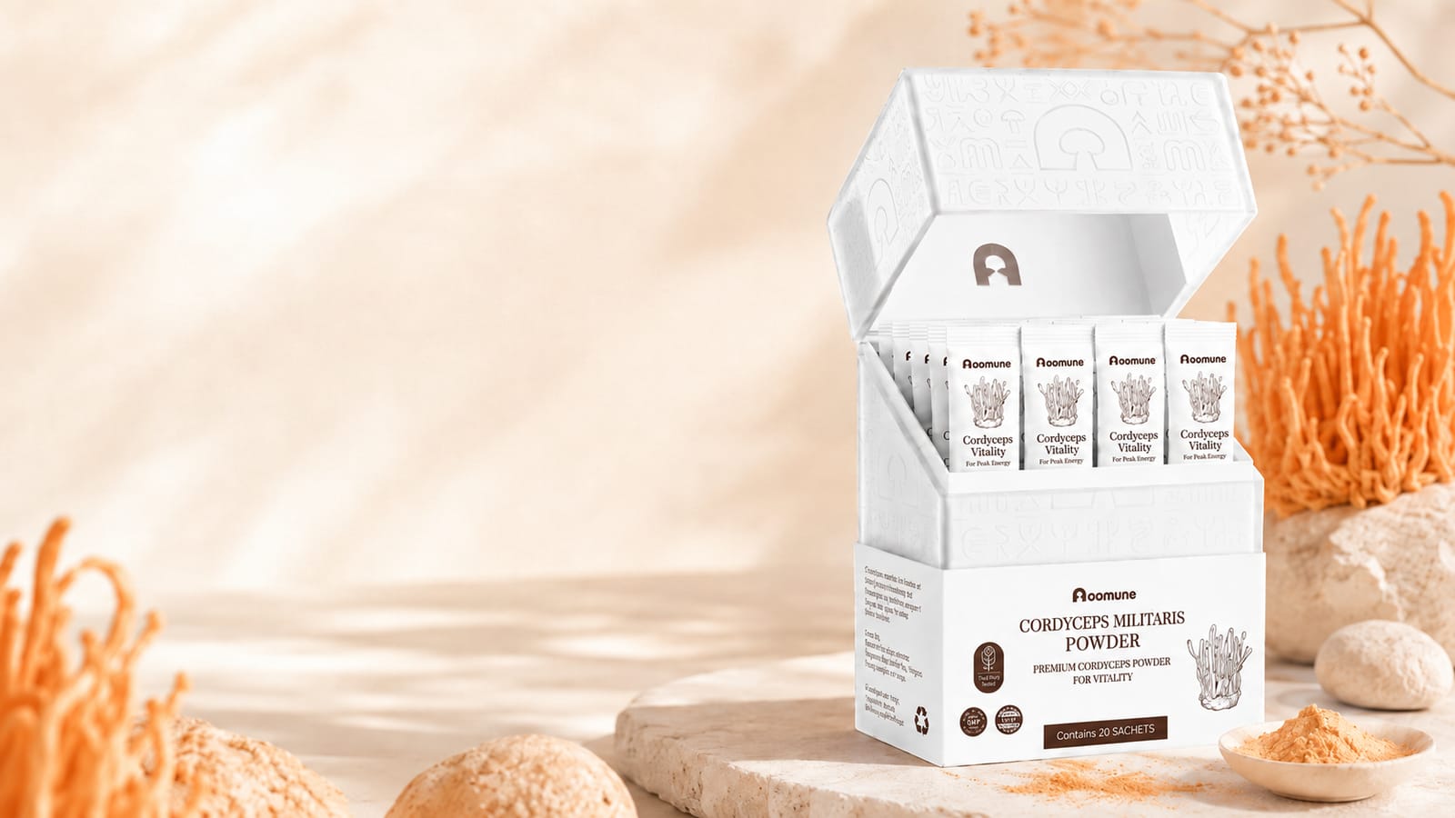
Powder box.
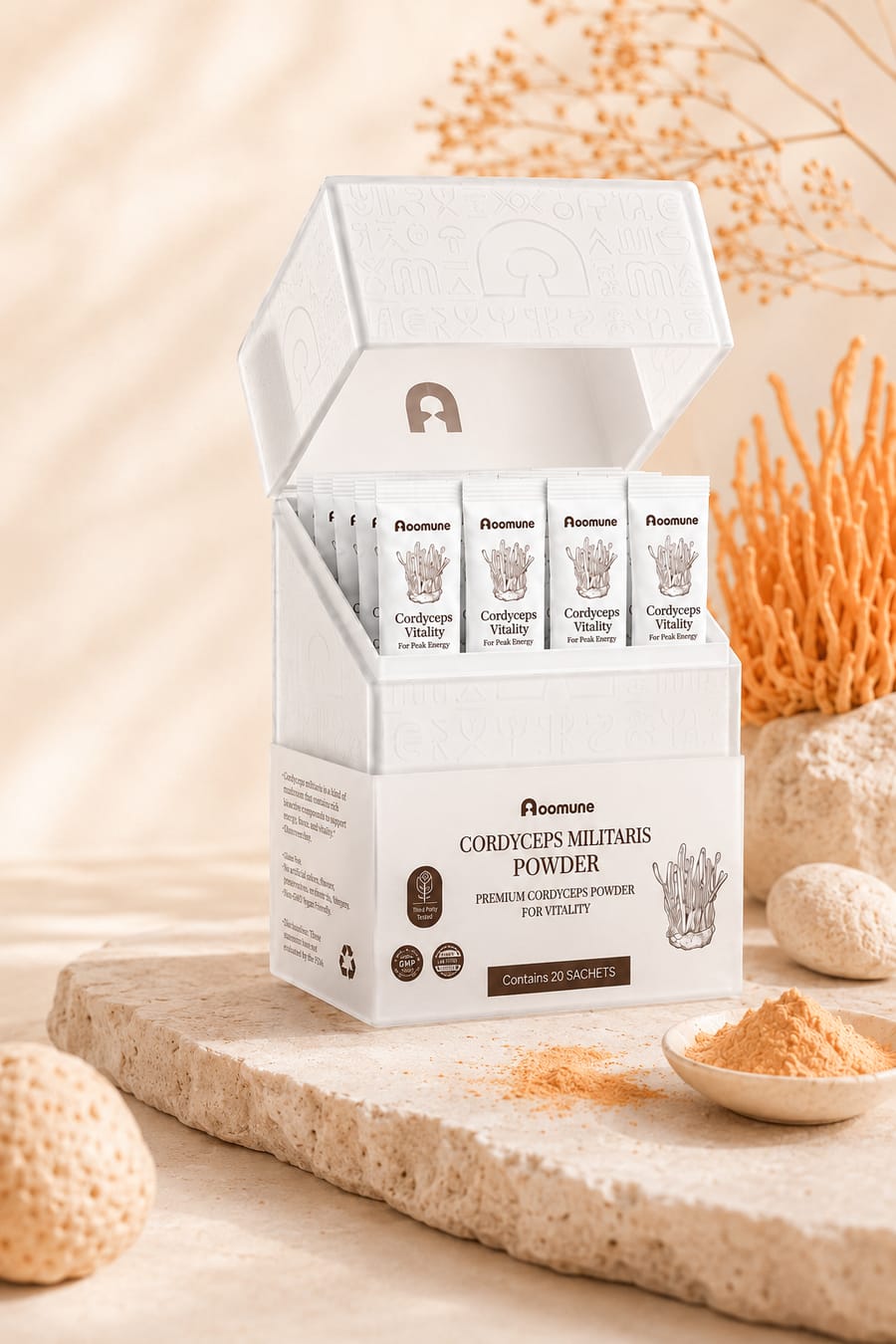
A flip-top box of single-serve sachets for the powder, using the same pattern, label layout and colours as the capsules.
Marketing
Product images.
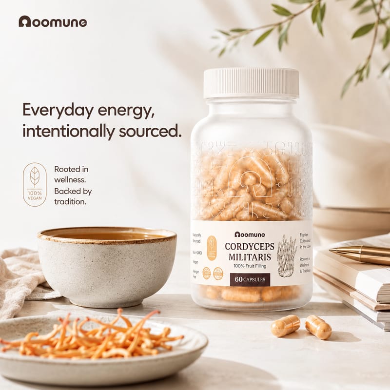
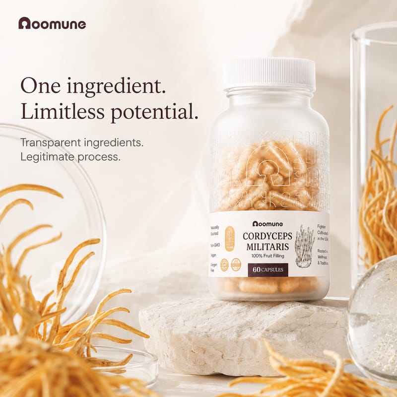
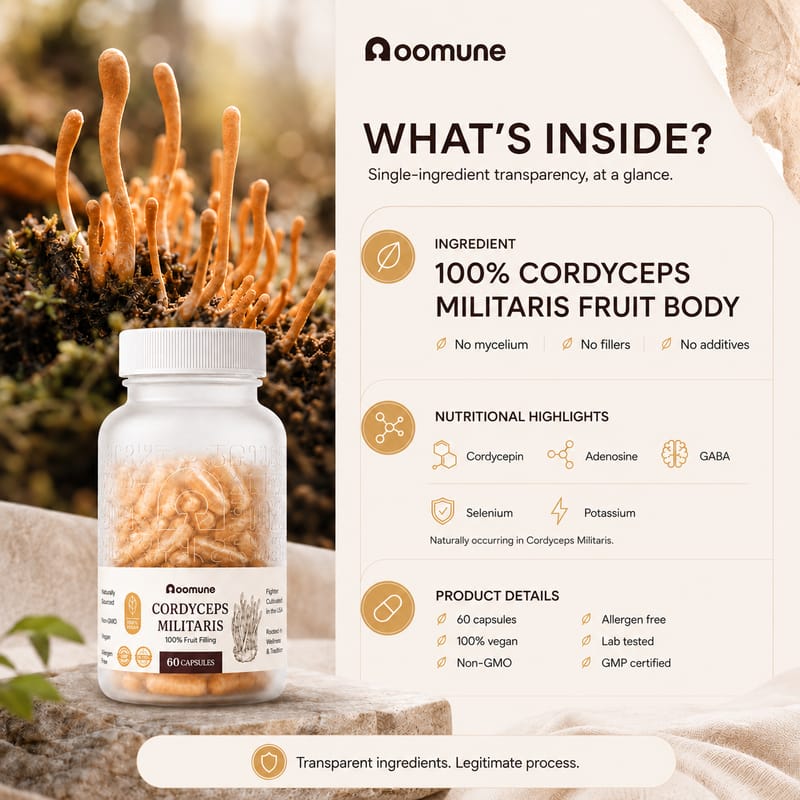
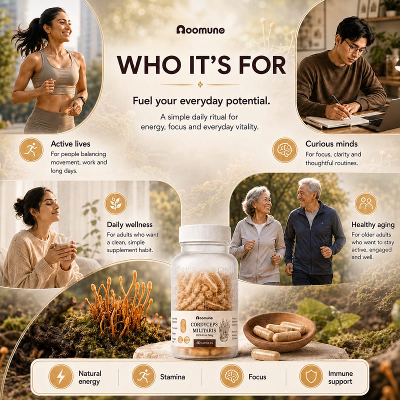
Images for the website and listings, each showing the product next to the mushroom it’s made from.
Marketing
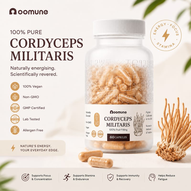
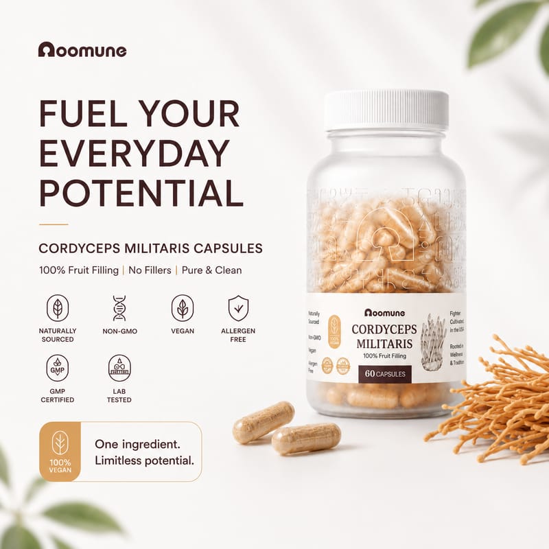
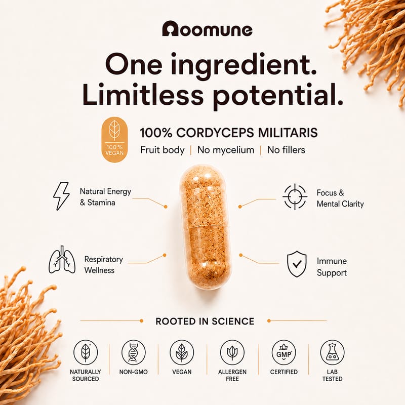
Quick-commerce listings.
Seven square images for quick-commerce apps, covering the product, what’s in it, the benefits and who it’s for.
Web
Website.
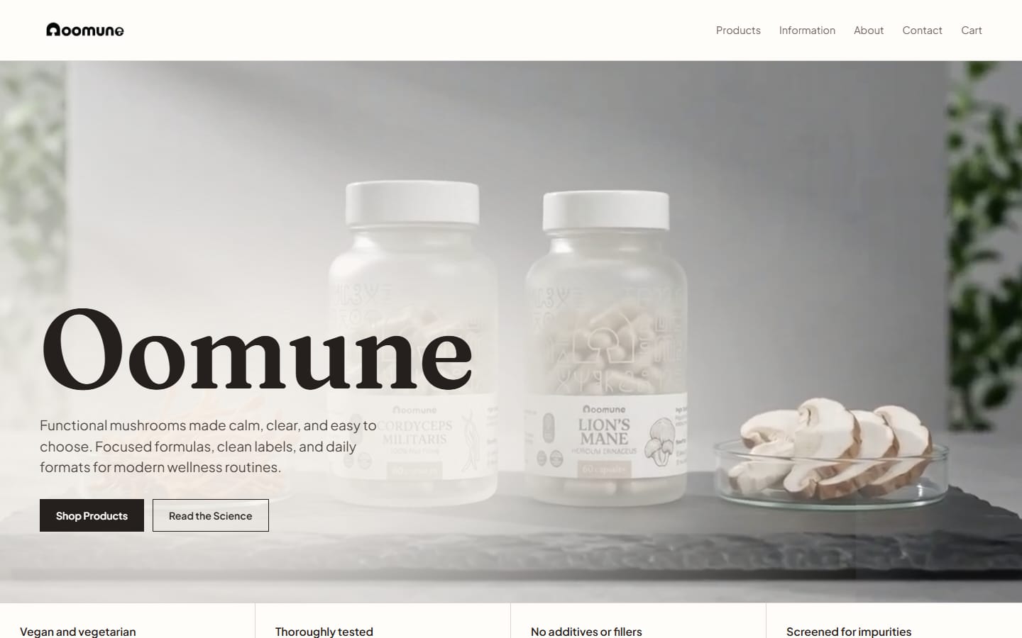
oomune.com: the product range, information on the science, and the lab reports, in the same colours and type as the packaging.