Brand Identity · CalArts Coursework
WaveScapeAn AR & depth-tracking experience for kids: build a world, build a thing, all from a room.
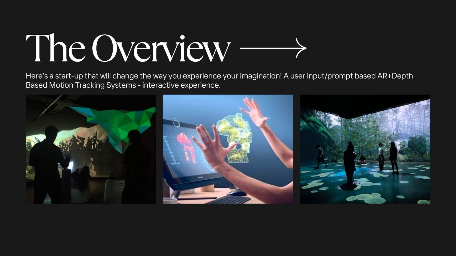
Overview
The brief
A start-up that changes how kids experience their imagination.
WaveScape is an AR + depth-based motion-tracking experience designed for children: an interactive room where prompts become worlds and gestures become things. Two modes, Build a World and Build a Thing, offer a tactile mix of projection, sound, and play that engages the senses without overloading them.
The story
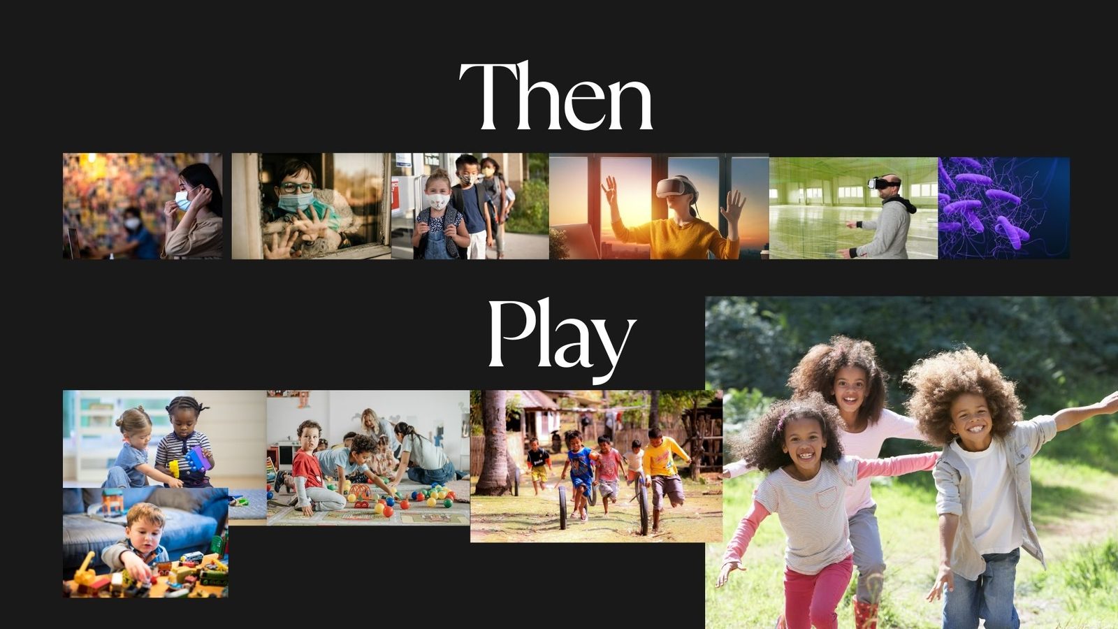
It started with a bored kid in a pandemic.
The product’s origin is a mother’s account of her son, an outdoorsy boy whose rich imaginative play collapsed inward when the world shut down.
“My boredom meter is off the charts!” the brief, in his own words
She wanted a tool that would light up his imagination, keep him moving, and stimulate his senses without overloading them. WaveScape is that tool, scaled up: a child-friendly, collaborative, user-driven immersive experience built for room-sized adventures.
Naming
From a longlist to a single word with a triangle inside it.
The shortlist mapped territory: collaboration (Co-Create), pathway (Pathways), build (InfiniBuild), wandering (SparkWander). WaveScape won: a name that holds both the soft physics of the medium (waves of light, sound, depth) and the open terrain of the experience (a scape to wander into).
Brand pillars
Three directions, one tone.
Every design choice (type, mark, palette, packaging) was checked against three pillars. They overlap; the goal is the centre of the venn.
Mood & references
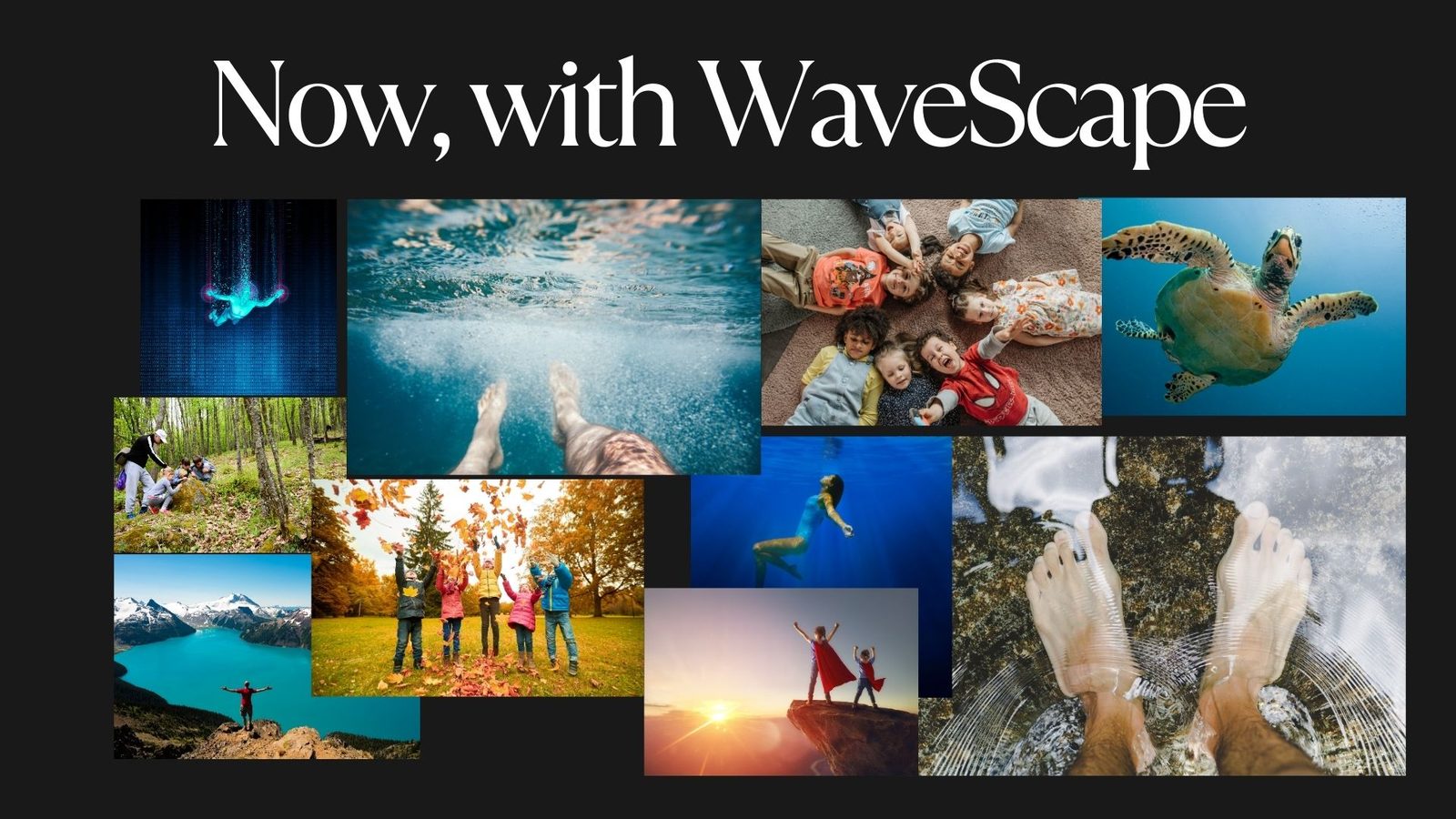
Then masks & screens. Now feet in water.
The moodboard plotted a before-and-after: the closed loop of the lockdown years on one side, and the sensory, embodied, water-and-leaves-and-sand of WaveScape on the other.
Landscape
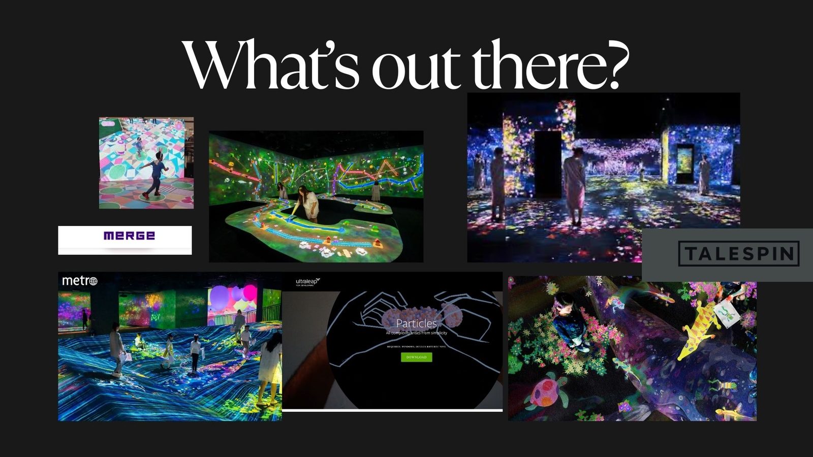
Whose neighbourhood is this?
Benchmarks across immersive rooms (teamLab, MERGE), AR storytelling (Talespin), and depth-tracking demos set the bar, and the gap. WaveScape’s opening was a child-first, friendly identity in a category dominated by chrome and cool.
Typography
Megrim for the wordmark. Special Elite for the in-jokes.
Megrim’s thin, geometric construction reads as drawn-on-graph-paper: childlike but precise. The in-built triangular ‘W’ gave us the brand’s secret weapon. A typewriter mono carries the chatty, hand-stamped voice of WaveScape’s in-product copy.
O P Q R S T U V W X Y Z
0 1 2 3 4 5 6 7 8 9
O P Q R S T U V W X Y Z
a b c d e f g h i j k l m n o p q r s t u v w x y z
Colour
A six-shape palette, one for each triangle.
Yellow leads (the play triangle), with sky blue and olive as the supporting colour pair. Steel and ink hold the system together; white is the canvas. The palette was built so any single triangle could swap roles: a small piece of brand-customisation built into the mark itself.
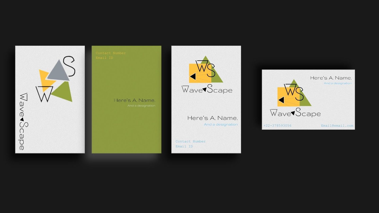
The mark
A wordmark with a play button hidden in plain sight.
Wave and Scape are stitched together by a small black triangle: a play arrow tipped on its side. From there, four triangles (yellow square, green prism, grey, blue) collapse and re-arrange into a kit of marks.
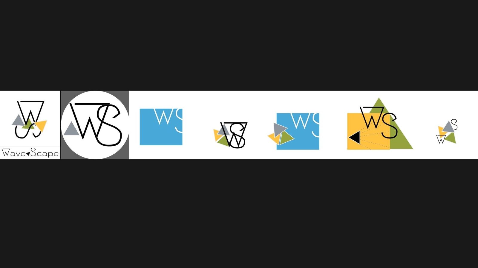
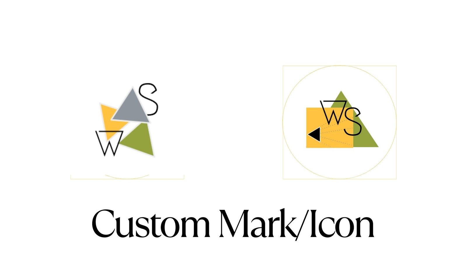
Secret ingredient
The triangles are recolourable on purpose.
Customisability is core to the product, so it’s core to the brand. The triangle stack is treated as a kit: rearrange them, swap colours, scale them up to a poster or down to a sticker; the system stays recognisable.
Click a triangle to cycle the brand palette · Shuffle for a random mix · Reset for the canonical mark
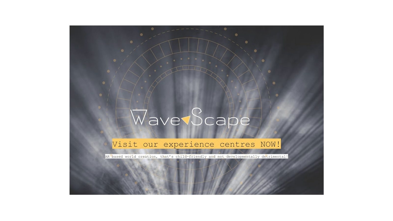
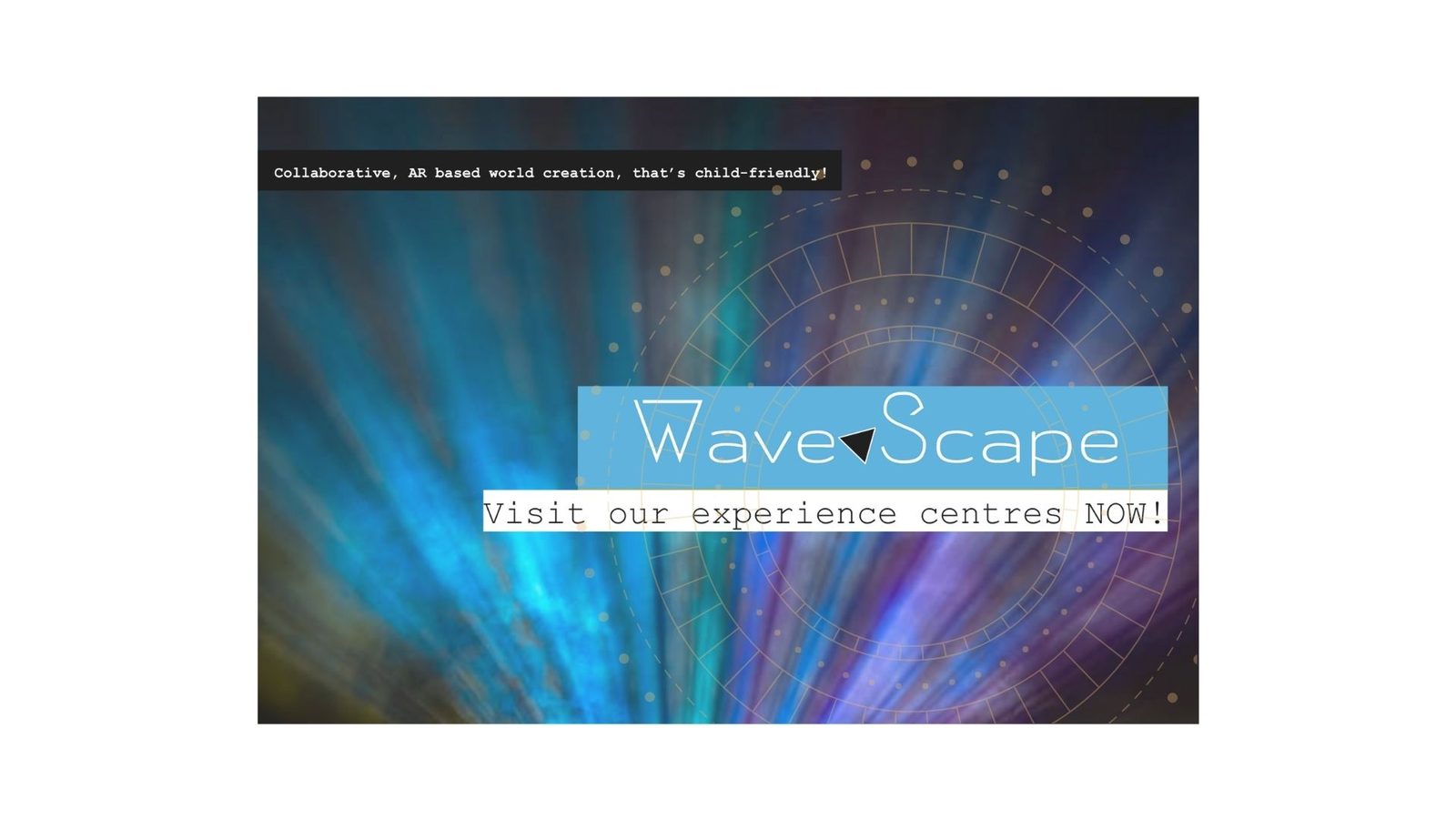
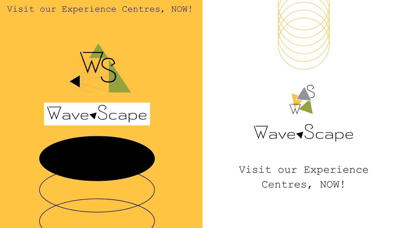
Posters · experience-centre ads
Two voices, one invitation.
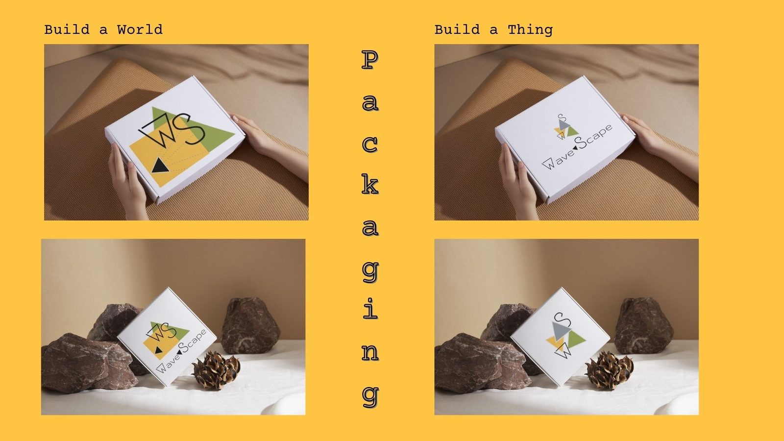
Packaging
Build a World. Build a Thing. Both arrive in a box.
The two product modes get two box treatments: same format, different triangle composition. Same kit on the shelf, different invitation when you open it.
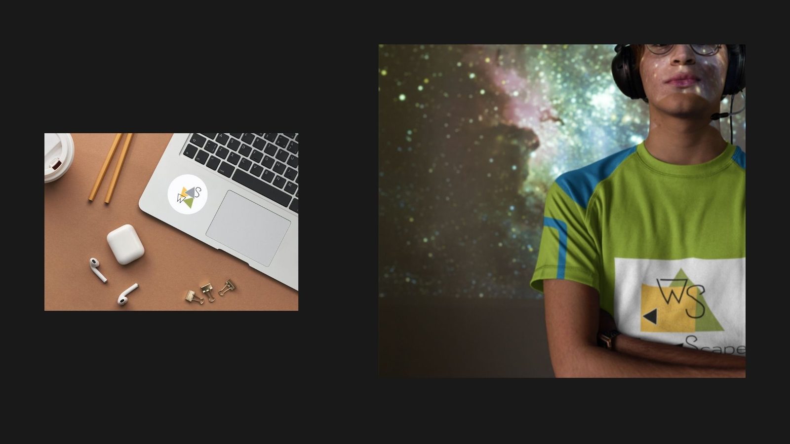
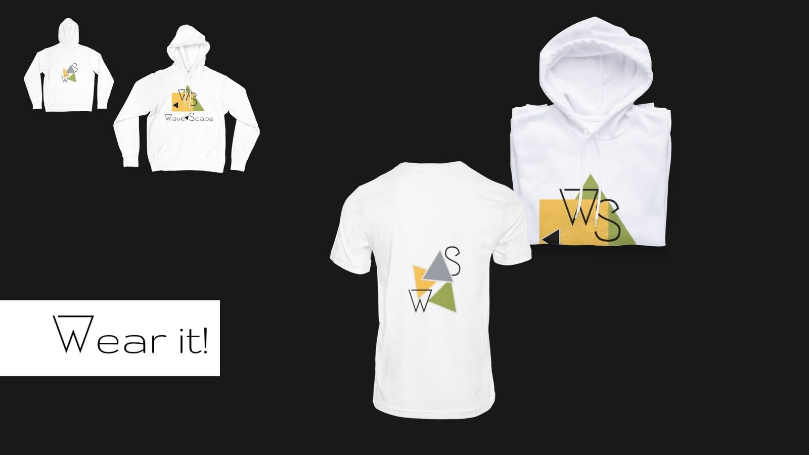
Wear it
Wear it!
The triangle stack is large, off-centre, and unmissable on apparel; no wordmark needed. Hoodies and tees pull the kit forward; the packaging is the merchandise.