Brand Identity · 2025-ongoing
A sustainable engineering company.
Built from ground zero: mark, font, website, signage.
Verticals
The Brief
Powering Sustainability.
From ground zero.
Grevoro needed a brand that could hold the weight of sustainable engineering - technical, forward-thinking, built to last. Everything made from scratch: the mark, a custom typeface, website, physical signage, and a system flexible enough for a growing family of verticals.
The Mark
Logo across contexts.
Typography
A font made for Grevoro.
The primary typeface is a custom design: geometric, industrial, with cut corners that echo the hex bolts in the mark. Built from scratch, letter by letter. Montserrat supports it for body copy.
ABCDEFGHIJKLMNOPQRSTUVWXYZ
1 2 3 4 5 6 7 8 9 0
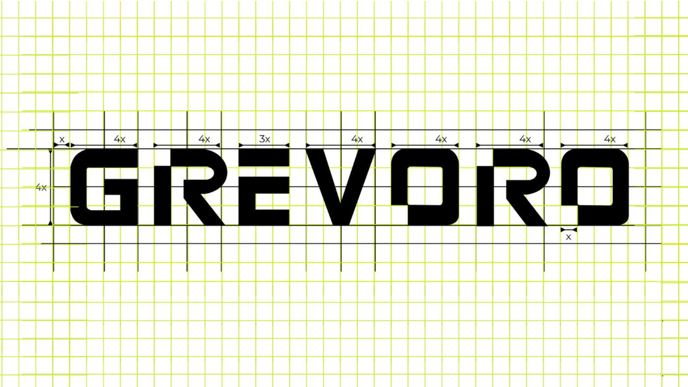
Construction
Built on a grid.
The custom Grevoro typeface was drawn on a modular grid: every letterform proportioned with precision. Character spacing, stem widths, and optical corrections all derive from a single unit x.
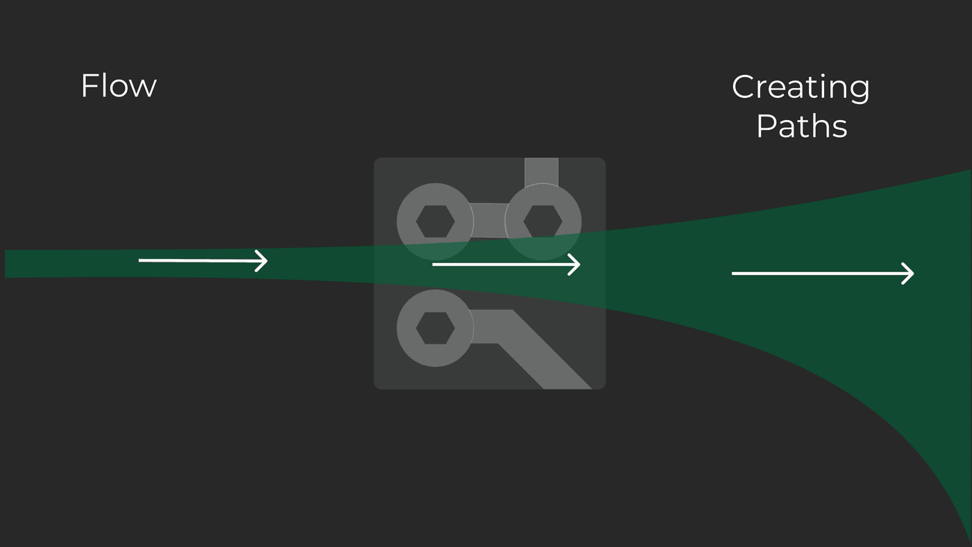
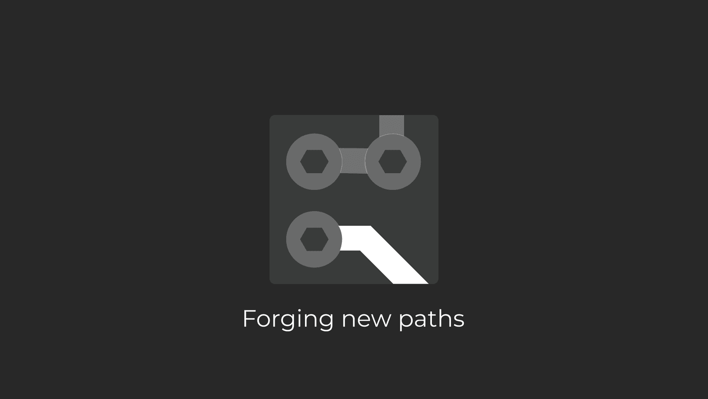
Logo Narrative
The mark tells a story.
The icon is not decoration; it's a diagram. Industrial hardware, circuit connections, a path forged from raw material to engineered solution.


Colour Palette
Grounded. Industrial. Alive.
Rooted in nature and industry: deep forest green, weathered patina, the dark plum of authority.
The Website
grevoro.com
Designed and developed the full website: brand-led, fast, built to convert.
Visit grevoro.com →